
Twenty years of the ECB Survey of Professional Forecasters
Twenty years of the ECB Survey of Professional Forecasters
Published as part of the ECB Economic Bulletin, Issue 1/2019.
It is twenty years since the ECB first launched its Survey of Professional Forecasters (SPF). The survey asks for point forecasts and probability distributions for HICP inflation, HICP inflation excluding energy, food, alcohol and tobacco, real GDP growth and the unemployment rate at six horizons, as well as point forecasts for wage growth, the exchange rate, the oil price and the ECB’s policy rate. All quantitative data collected in the survey are systematically published shortly after the completion of the survey. This makes the SPF the most long-standing, comprehensive and transparent survey of the aggregate euro area economy.
The past twenty years have seen a wide variety of economic conditions, including the Great Moderation, with relatively high economic growth and stable inflation, the financial crisis and, more recently, a prolonged period of subdued inflationary pressures. This article documents the evolution of the SPF through this changing economic landscape and what we have learned from it. The SPF remains as useful for economic analysis and as relevant to the monetary policy debate today as it was when it was first launched.
1 Introduction to the Survey of Professional Forecasters
Inflation expectations play a central role in the ECB’s economic and monetary analyses, particularly in view of its mandate to maintain price stability in the euro area. The ECB sets monetary policy with the aim of maintaining annual euro area HICP inflation at a rate below, but close to, 2% over the medium term. In this context, private agents’ inflation expectations can affect the economy, because they can influence economic decisions in areas such as saving, consumption and investment, as well as wage and price setting. The role of inflation expectations in determining actual wage and price inflation can be modelled in a forward-looking Phillips curve relationship. Similarly, financial market participants’ inflation expectations can directly influence the pricing of some financial instruments, such as nominal bonds, and thus directly affect the transmission of monetary policy to the real economy.[1] In addition, inflation expectations also serve as a valuable cross‑check on the inflation outlook in the Eurosystem/ECB staff macroeconomic projections, which in turn inform monetary policy decisions. The ECB therefore closely monitors private agents’ inflation expectations using a range of sources, not least the results of its own quarterly Survey of Professional Forecasters (SPF).
The SPF has measured inflation expectations and other macroeconomic expectations since the beginning of monetary union. At the time of its launch, the SPF was the only gauge of private sector macroeconomic expectations for the euro area as a whole. The survey collects information on the expected rates of consumer price inflation, wage growth, real GDP growth and unemployment in the euro area at several horizons, ranging from the current year to the longer term. In addition, respondents provide expectations for exogenous variables underpinning their forecasts, such as the oil price and the exchange rate, and qualitative comments that enrich their quantitative forecasts. Thus the overall survey results provide a comprehensive depiction of experts’ aggregate assessment of the macroeconomic outlook.
Expectations are sampled at different horizons for different purposes. In the shorter term, expectations are collected for the current and the following two calendar years, as well as two rolling horizons, one year and two years ahead of the latest available data. The evolution of shorter-term expectations allows us to track how the professional forecasting community is assessing new information about the shocks hitting the economy, e.g. from the incoming data, as well as learning about the effect of a given shock. In this context, calendar year point forecasts can easily be compared with those published in other surveys or with Eurosystem/ECB staff macroeconomic projections. The rolling horizons are better suited to measuring how perceptions of risk and uncertainty evolve over time, because these abstract from the natural decline in uncertainty that tends to occur as the forecast horizon shrinks. Finally, longer-term expectations can reveal information about the perceived steady state of the economy. In particular, longer-term inflation expectations can tell us about confidence in meeting the inflation objective.
Probability distributions provide a quantitative assessment of risk and uncertainty. A distinguishing feature of the SPF is that for inflation, core inflation, unemployment and real GDP growth, expectations at all horizons, including the longer term, are collected not just in the form of point forecasts, but also probability distributions. This allows a quantification of forecast uncertainty and of whether forecasters consider the uncertainty to be broadly balanced around their point forecast or skewed towards the upside or the downside.
The respondents to the survey are expert economists working in either financial or non-financial institutions, using different forecasting methodologies. Approximately 55 responses are received each quarter, which is relatively high compared with other expert macroeconomic surveys for the euro area as a whole. The majority of respondents are from financial institutions, although a significant number of economic research institutions also contribute. Since 2008 a special survey conducted every five years has provided additional insight on how the expectations reported in the SPF are formed (see Box 1).
High data transparency and economic relevance have led to considerable research based on the SPF. All the quantitative data, including microdata, are published on the ECB’s website each quarter, along with the summary report. This has helped stimulate substantial academic research into the SPF and what we can learn from its results. For a selective summary of such research, see Box 2.
This article looks at twenty years of results from the SPF and what we have learned from them. Section 2 explores the extent to which co-movement of expectations for pairs of variables is informative of the underlying economic relationships. Sections 3 and 4 examine, respectively, the point forecast results and the risk parameters implied by the probability distribution functions (PDFs), while Section 5 considers what we can learn from the longer-term expectations. Section 6 concludes.
Box 1 The 2018 special survey: forecasting processes and methodologies and how they have changed over time
The five-yearly special survey is an important tool for understanding how SPF participants make their forecasts and form their expectations. In particular, it can track whether and how forecasters are adapting to the challenges posed to underlying economic relationships by episodes such as the financial crisis or the more recent period of protracted low inflation. This box summarises selected results on forecasting processes and methodologies in the 2018 survey and discusses how they have changed over time.[2]
Reduced-form models remained the predominant tool for short and medium-term forecasts, while for longer-term forecasts models with economic structure were more widely used. On average across variables, 80% of respondents in the 2018 survey indicated that they use reduced-form models for their short-term forecasts, compared with 60% for longer-term forecasts (see Chart A, upper panel). Models with economic structure are used by 40% of respondents for longer-term forecasts, compared with 20% for short-term forecasts. These numbers are broadly similar to those found in the 2013 survey, reconfirming the shift in relative usage compared with the 2008 survey.
Expert judgement also continued to play an important role, especially for longer-term forecasts, for which it has become more important over time. Across all variables and horizons, on average little more than 10% of respondents in the 2018 survey said that they rely solely on model outcomes. For most variables and horizons, the share is lower than in the 2008 and 2013 surveys. For longer-term horizons, approximately 50% of point forecasts were essentially judgement-based. Following the 2008 crisis, the shift towards increased judgement was reflected more in an increase in essentially judgement-based forecasts, while since the period of protracted low inflation there has been a greater shift towards models with judgement-based adjustment (see Chart A, lower panel). The degree of judgement underlying the probability distributions is generally higher than for the point forecasts. In the 2018 special survey, 75% of respondents indicated that their probability distributions were essentially judgement-based.
The shifts in relative importance are consistent with the answers to questions on the impact of specific economic episodes. In the 2013 special survey, 70% of respondents reported that in response to the 2008 crisis they used more judgement. The 2018 special survey asked the same question in respect of the period of prolonged low inflation, and 75% of respondents indicated that they supplemented their models with a higher degree of judgement. In this respect, the higher degree of judgement after the 2008 crisis may have coincided with a greater use of reduced-form models for two possible reasons. On the one hand, the crisis may have undermined forecasters’ confidence in the ability of structural models to capture the structure of the economy at a time of potentially large structural changes. On the other hand, forecasters may have opted for reduced-form models because of the relative ease of applying more judgement to them.
Chart A
Use of reduced-form or structural models and model-based or judgement-based methods for short, medium and longer-term economic forecasts
(percentages of respondents)

Sources: SPF and ECB staff calculations.
Note: ST stands for short term, MT for medium term and LT for longer term.
Box 2
A selective summary of economic research based on the SPF
The rich body of information in the SPF has attracted researchers from academia and international institutions. Besides aggregate forecasts, the ECB also publishes microdata on the point and density forecasts of individual SPF forecasters in an anonymised form. Researchers have used these various data dimensions for a variety of analytical purposes as follows:
Forecast performance: One strand of the literature compares SPF forecasts to benchmark forecasting models and finds that the survey responses provide useful information about future economic developments. Bowles et al. (2010) and Grothe and Meyler (2018) analyse aggregate forecast errors for unemployment, GDP growth and inflation at business cycle frequency. They conclude that average expectations in the SPF perform better than naïve or purely backward-looking benchmark models. Exploiting the panel dimension of the SPF data, Genre et al. (2013) apply several combination schemes of the individual forecasts, such as principal component analysis, performance-based weighting, and Bayesian shrinkage, and find that a simple average of SPF forecasts is hard to beat using the more sophisticated methods.[3]
Forecast uncertainty: Since the financial crisis there has been increased interest in the uncertainty surrounding SPF point forecasts. Abel et al. (2016) find a countercyclical behaviour of forecast uncertainty and, in line with other papers (for example Łyziak and Paloviita, 2017), document a rise in uncertainty in the post-crisis period. While the cross-sectional forecast disagreement has also increased since the crisis, it has proven to be a poor proxy of forecast uncertainty (see Glas and Hartmann, 2016). Rich and Tracy (2018) exploit the SPF microdata to calculate a measure of how much an individual respondent’s distributional forecast differs from all others reported in a particular survey round. They find considerable heterogeneity across forecasters and document little relation between this measure of distributional difference and individual forecast uncertainty. While individual uncertainty is very persistent over time, the measure of distributional difference shows pronounced time-variation.[4]
Anchoring of inflation expectations: Another strand of the literature highlights that the long-run inflation forecasts reflect trust in the central bank inflation objective. Beechey et al. (2011) show that average long-run inflation expectations in the SPF are very stable and show little variation across forecasters. They conclude that expectations are firmly anchored, which is in line with the findings of Grishchenko et al. (2017), who estimate a dynamic factor model of aggregate US SPF and ECB SPF data. For a short and limited period after the crisis, Grishchenko et al. (2017) and Łyziak and Paloviita (2017) document mild signs of de-anchoring. In a panel analysis of the individual SPF inflation forecasts, Dovern and Kenny (2017) confirm the anchoring of SPF inflation expectations, but find significant shifts in higher moments of the distribution of long-run inflation forecasts in the post-crisis period.[5]
Expectations formation: Recent studies investigate whether forecasts are made according to specific economic relationships or rules. Frenkel et al. (2011) find that the expectations of SPF participants are consistent with standard macroeconomic relationships, such as the Phillips curve or Okun’s law. Reitz et al. (2012) study the individual oil price forecasts from the SPF and document a complex and non-linear formation process for oil price expectations.[6]
The wide range of research areas for which SPF data are used highlights the usefulness of the dataset for academic and applied research. In particular, analyses related to the anchoring of long-term inflation expectations, changes in the expectation formation in the post-crisis period and the pronounced increase in forecast uncertainty are of high policy relevance.
2 What do SPF results reveal about underlying economic relationships?
Forecasters typically form their expectations on the basis of economic concepts and relationships. Differences in perceived underlying relationships can thus be an important source of differences between forecasts and need to be considered in the assessment and communication of expectations. For instance, relationships such as the Phillips curve or Okun’s law are building blocks of many macroeconomic models and often shape the common economic thinking of the professional forecasting community. The ECB reviews and uses such relationships in its economic analysis,[7] and it is important to understand whether SPF expectations are also generated in line with corresponding economic relationships. So what are the conventional ways of specifying these relationships and to what extent can they be tested using SPF data?
The Phillips curve connects price or wage movements with measures of economic slack, such as the output or unemployment gap. A widely used version is the New Keynesian Phillips curve that can be expressed in the following equation:
where current inflation ( ) is a function of the unemployment gap, defined as the difference between the unemployment rate and its structural rate (often represented by the non-accelerating inflation rate of unemployment, NAIRU), and a term for expected future inflation . As well as the unemployment gap, economic slack can also be measured using the output gap, i.e. the difference between actual output and a measure of potential output. Some versions of the Phillips curve (especially earlier versions) do not include expected inflation. A similar concept exists for wages, where price inflation is replaced by a measure of wage inflation.
Okun’s law describes the relationship between the unemployment rate and GDP growth. A widely used version relates changes in the unemployment rate to real GDP growth, as in the following equation:
where Okun’s coefficient is negative and describes the strength of the relationship. If real GDP growth is one percentage point higher, the unemployment rate falls by percentage points. Another widely used formulation relates the unemployment gap to the output gap.
The results of the 2018 special survey indicate that point forecasts for the key variables tend to be jointly determined. Participants had the opportunity to specify whether any joint determination of their forecasts was done in a formal manner, e.g. within one model, or more informally, e.g. through expert consideration of, and judgement applied to, model outputs. Across the different pairs of economic variables, on average over 80% of respondents indicated that their point forecasts were determined jointly, and predominantly in a more informal manner (see Chart 1). By contrast, only about 40% of respondents indicated that they prepare their PDFs jointly.
Phillips curve and Okun’s law relationships were primarily used to inform revisions to forecasts at medium-term horizons (from one to three years ahead). This is consistent with there being a greater role for idiosyncratic shocks in the short term (the next twelve months), whereas longer-term expectations would be more influenced by views on the structural parameters of the economy. Similarly, the proportion of forecasters indicating that they revised the HICP inflation PDFs jointly with either their GDP growth or unemployment rate PDFs was greatest at the medium-term horizon, although the overall shares of positive responses were lower than for the point forecasts.
Chart 1
The extent to which SPF expectations are jointly determined
(percentages of respondents)

Sources: SPF and ECB staff calculations.
Indeed, these macroeconomic relationships can also be seen in the aggregate data. A scatter plot of aggregate point forecasts from the SPF shows a negative relationship for two-year-ahead forecasts of inflation and the unemployment rate, which is consistent with a Phillips curve relationship (see Chart 2). However, the correlation between the two variables significantly weakened in the post-crisis period, which is consistent with the evidence presented in Box 3.[8] Moreover, aggregate two-year-ahead forecasts of real GDP growth and changes in the two-year-ahead forecasts for unemployment exhibit a negative correlation, which is in line with Okun’s law. However, the negative correlation was not statistically significant before 2008 and has strengthened considerably in the post-crisis period. This observation is also present in realised data, which show a strong increase in the correlation between GDP growth and unemployment in the post-crisis period. The effect has been especially strong since the start of the recovery and points towards a possible structural change in the unemployment-GDP relationship.[9]
Chart 2
Correlation analysis of mean point forecasts
(inflation and GDP growth: annual percentage changes; unemployment: percentages of the labour force)

Sources: SPF and ECB staff calculations.
Notes: Panel a: scatter plot of the mean point forecast for inflation (vertical axis) and unemployment (horizontal axis) in two years’ time. Panel b: scatter plot of the change in the unemployment forecast in two years’ time between two consecutive survey rounds (vertical axis) and the mean point forecasts for GDP growth in two years’ time (horizontal axis). Sample period: from the first quarter of 1999 to the last quarter of 2018.
Box 3 Stability of the price Phillips curve implied by SPF microdata
Forecasts reported in the SPF can be used to investigate the existence of, and time variation in, the relationship between different economic variables. This box examines whether the Phillips curve link between inflation and unemployment point forecasts of individual respondents changes over time. The analysis is carried out in terms of revisions rather than levels of point forecasts to abstract from presumed time-invariant differences between forecasters. The relationship is described by the slope of a price Phillips curve estimated in the following regression:
where and denote the revision of, respectively, expected inflation and the expected unemployment rate for the next calendar year in survey round t of forecaster i and denotes the forecast revision of expected inflation for the subsequent calendar year. Forecast revisions are defined as the change in the point forecast between two consecutive survey rounds. The sample period is from the first quarter of 1999 to the last quarter of 2018. Using the full sample and pooling over all forecasters, the Phillips curve slope has a statistically significant negative value of -0.09.
Five-year rolling window regressions suggest that the slope of the implied Phillips curve has substantially flattened. While the slope of the Phillips curve was relatively stable (but imprecisely estimated) before the financial crisis, the slope consistently converged to zero in the post-crisis period and has remained there in recent years. Using long-term expectations,[10] the regression uncovers no relationship between unemployment and inflation forecast revisions, reflecting rather small variations at that horizon, but also supporting the view of monetary neutrality in the long run (yellow line in Chart A).
Chart A
Rolling window estimation of the slope of the price Phillips curve implied by SPF microdata
(estimated slope coefficient)

Sources: SPF and ECB staff calculations.
Notes: The blue line shows the slope coefficient
of the New Keynesian Phillips curve specified above, estimated using rolling windows with a window length of five years for each end-date of the rolling window estimation. The grey lines show the 95% confidence interval of the coefficient. The yellow line shows the slope coefficient of a regression of revisions to long-term inflation expectations on revisions to long-term unemployment expectations, estimated using rolling windows of the same length. This coefficient is never significantly different from zero.
This analysis points to changes in the link between the formation of unemployment and inflation forecasts. While the SPF unemployment and inflation forecasts are generally in line with a price Phillips curve, the analysis also reveals that the macroeconomic relationship has considerably weakened in the post-crisis period. The results suggest that other factors, such as judgement-based forecasts (see Box 1), have gained in importance for the expectations formation process.
3 How have SPF point forecasts evolved over time?
HICP inflation and real GDP growth outturns have been affected by strong and persistent shocks over the last ten years. In the first ten years of the SPF, HICP inflation was mostly a little over 2%, and was modestly, although persistently under-predicted by the aggregate forecast of the SPF, while aggregate real GDP growth forecasts either over-predicted or under-predicted the actual outturns. The last ten years have seen much greater swings in these variables and have been more characterised by overestimation of both HICP inflation and real GDP growth (see Charts 3 and 4).
Chart 3
Aggregate HICP inflation expectations and outturns
(annual percentage changes)
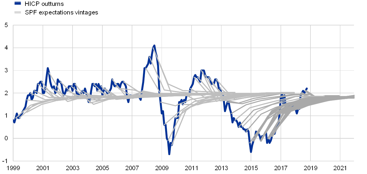
Sources: SPF and ECB staff calculations.
Note: The inflation expectations profiles for each survey round (in grey) comprise the 12 and 24-month-ahead and longer-term expectations.
Chart 4
Aggregate real GDP growth expectations and outturns
(annual percentage changes)
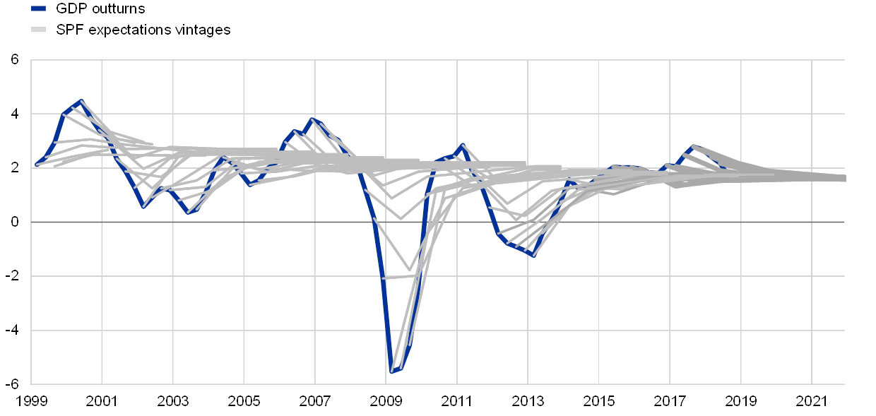
Sources: SPF and ECB staff calculations.
Note: The real GDP growth expectations profiles for each survey round (in grey) comprise the 4 and 8-quarter-ahead and longer-term expectations.
SPF forecasts have typically exhibited strong reversion to trend. Despite the magnitudes of the gyrations in both HICP inflation and real GDP growth, SPF forecasts have tended immediately to revert back towards a long-run trend (exceptions being real GDP growth expectations in 2008 and 2011, when the sharp fall in the growth rate was expected to continue before recovering). In general, the further the data were from their perceived trend, as proxied by the longer-term expectation, the stronger was the movement expected back towards that trend. In other words, there is a strong negative relationship between deviation from trend, and the change expected over the next two years (see Chart 5). This relationship holds more tightly for inflation, which could be interpreted positively as an indication of the strength of the inflation anchor.
Chart 5
Reversion to trend in SPF forecasts
(percentage points)

Sources: SPF and ECB staff calculations.
Notes: In each panel, the x-axis denotes the distance from trend, measured as the deviation between the latest data on HICP inflation or real GDP growth at the time of each survey round and the longer-run expectation of that variable, while the y-axis denotes the steepness of the short-term expectation path, measured as the change expected in the variable over the next two years.
As well as the point forecasts themselves, the constellations of forecast errors can be informative about potential changes in underlying economic relationships. For example, a historically unusual pattern of forecast errors for wage growth and unemployment beginning in 2013 may point to a structural break in euro area labour market dynamics. Until 2013, SPF forecast errors for wage growth tended to mirror those for unemployment: episodes of weaker-than-expected wage growth coincided with a higher-than-expected unemployment rate and vice versa. After 2013, however, that pattern changed and both wage growth and the unemployment rate were jointly overestimated (see Chart 6). Similarly, Eurosystem/ECB staff projections of compensation per employee growth during this period consistently over-predicted, while forecasts of employment growth under-predicted.[11] This might suggest that, even though the amount of slack in the labour market (as measured by the unemployment rate) turned out to be less than expected, other factors kept wage growth subdued.[12]
Chart 6
SPF near-term projection errors for the unemployment rate and wage growth
(percentage points)

Sources: SPF and ECB staff calculations.
Notes: The projection horizon is the calendar year after the x-axis date. Projection errors are defined as the outturn, according to the most recent data, minus the expectation.
Box 4 Assessing individual forecaster performance
Determining whether the heterogeneity in individual forecaster’s forecasting performance is due to chance or differences in forecasting ability is challenging for a number of reasons. First, all we can observe is the (ex post) forecast error once the outcome is realised. However, a large/small forecast error does not necessarily imply a bad/good forecast at the time the forecast was made (i.e. ex ante) because the error might just reflect an unanticipated shock related, for example, to oil prices, weather or exchange rates. Second, there is also the difficulty of making comparisons across different variables and forecasting horizons. For instance, a forecaster might perform relatively well when forecasting HICP inflation one year ahead but relatively poorly when forecasting real GDP growth two years ahead. Third, not all forecasters respond in every round and not all provide forecasts for all variables/horizons (in technical terms, it is an unbalanced panel). Thus it could be that a particular forecaster did not respond when it was relatively easy/hard to make a forecast and this could affect the forecaster’s average error.
We address the question of chance versus ability using techniques known as “bootstrapping” and “Monte Carlo simulation”.[13] The basic idea is to take the forecast errors for a given variable/horizon in each period and randomly reallocate them across the forecasters who provided a forecast in that period for the specific variable/horizon (also known as bootstrapping).[14] This process is then repeated a large number of times, for example one thousand (also known as Monte Carlo simulation), to simulate the distribution of forecast errors under the assumption (null hypothesis) of equal forecasting ability.[15] If the actual distribution of forecast performance lies within given confidence bands (for example, 1% and 99%) of the simulated distribution, then we cannot reject the null hypothesis that forecasters have equal ability and that differences in performance are largely due to chance.
At first glance, the results suggest that some forecasters perform better/worse than would be expected if the null hypothesis of equal ability were true. For example, panel a of Chart A shows that, for HICP one-year-ahead forecasts, there are a number of forecasters who perform better than would be expected under the null hypothesis of equal forecasting ability and some that perform worse. This is shown by the fact that the actual distribution lies below/above the simulated distribution for the better/worse ranked forecasters. This pattern is generally repeated for the other variables/horizons.
Chart A
Actual and bootstrapped/simulated distributions of forecaster performance for HICP one year ahead
(y‑axes: percentage points; x-axes: forecasters by rank)

Sources: SPF, Eurostat and ECB staff calculations.
However, the apparent over/under performance appears to be a statistical artefact. First, if individual forecasters indeed had above/below average forecasting ability, we might expect to see some correlation in performance rankings across sample periods. In this regard, it is telling that the correlation of the rankings of forecast performance across the pre- and post-crisis periods is close to zero (see Table A), with the exception of HICP two years ahead, where the correlation between the ranking for the pre-crisis and post-crisis periods for HICP two-year-ahead forecasts is 0.37. Second, panel b of Chart A shows that the apparent over/under performance for HICP one year ahead disappears if one controls for autocorrelation in the errors (in this case by taking only the forecasts in the first quarter of each year).
Table A
Correlation of forecasting ranks across two sub-sample periods (1999-2008 and 2009-2018) for one-year-ahead and two-year-ahead forecasts

Sources: SPF and ECB staff calculations.
To sum up, there is no strong evidence of statistically significant differences in forecasting ability. In fact, the aggregate SPF forecast (which averages all individual responses) is always in the upper quartile across the 12 permutations[16] of variable, horizon and period and is ranked first overall when aggregating across variables, horizons and periods. This suggests that it is hard to consistently beat the simple average.[17]
4 How have SPF probability distributions performed over time?
PDFs allow survey respondents to express their views on the complete range of outcomes and are thus a valuable complement to point forecasts. Forecasters assign probabilities to outcomes of each variable at each horizon in an interval half a percentage point wide.[18] Each quarter the SPF reports the aggregate probability distribution, i.e. the average of all probabilities reported for each interval. These distributions, at both the individual and the aggregate level, allow a quantitative assessment of perceived risk and uncertainty, adding the extra dimension of information to the point forecasts.
The aggregate probability distributions for the individual variables have seen dynamic and often large movements over the years (see Chart 7). In particular, there are some notable differences in the PDFs reported in the first ten years and the latest ten years of the SPF, which broadly correspond to the pre- and post-crisis periods. These reflect not only differences in the location of the PDFs, echoing differences in the point forecasts, but also differences in the shape of the PDFs. For example, even though at the two-year horizon the perceived deflation risk has vanished, the probability assigned to relatively low inflation outturns (<1.5%) is still quite elevated, as the PDFs have a more negative skew.
Chart 7
Two-year-ahead probability distributions for inflation, real GDP growth and unemployment
(percentages)

Sources: SPF and ECB staff calculations.
Forecasters’ assessments of uncertainty seem to have increased permanently in 2009, across all variables and horizons. Aggregate uncertainty is typically measured by the width of the aggregate PDF. This, in turn, is determined by two factors: how uncertain each forecaster is, i.e. the width of the individual PDFs being aggregated, and how much forecasters disagree about the most likely outturn, i.e. the extent to which the individual distributions are centred differently. One striking feature of the SPF data is that, across all variables and horizons, there was a step increase in forecasters’ individual uncertainty at the time of the financial crisis (see Chart 8) which has persisted ever since. The effect of disagreement on aggregate uncertainty, on the other hand, has been much more varied across economic variables, forecast horizons and time.
Chart 8
Forecasters’ assessment of uncertainty
(average standard deviation of forecasters’ probability distributions in percentage points)
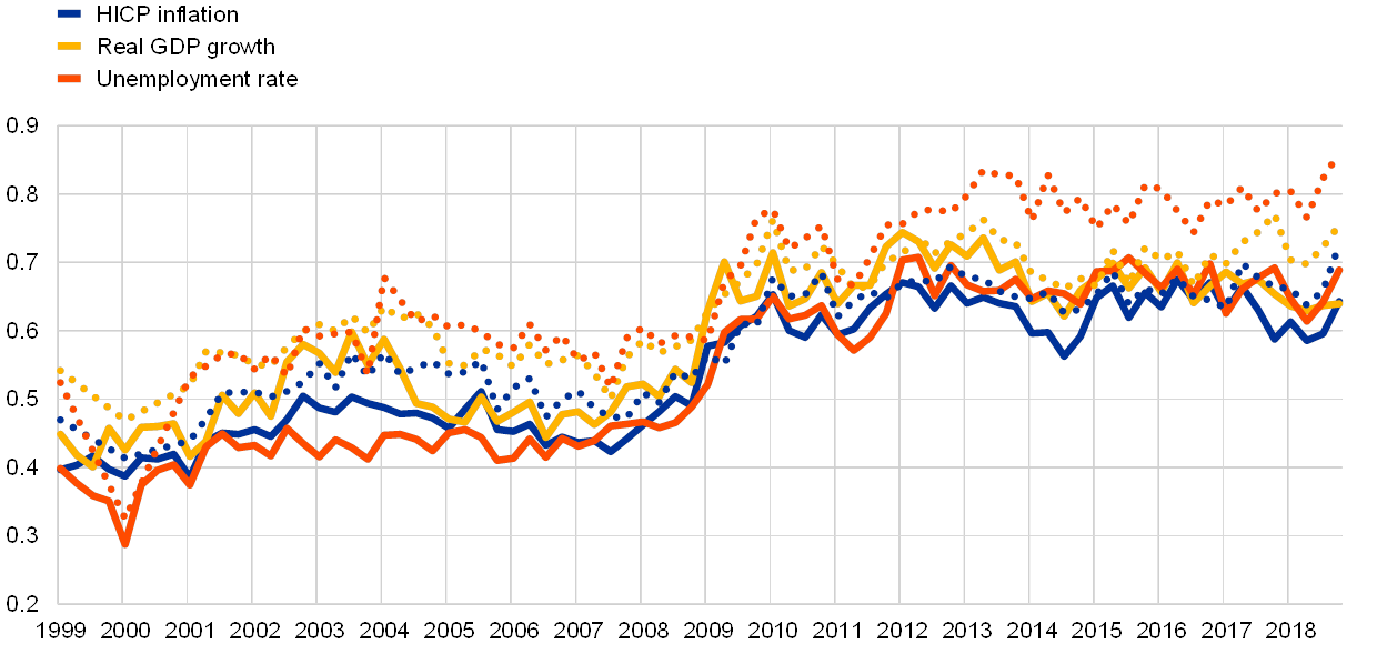
Sources: SPF and ECB staff calculations.
Notes: Solid lines depict two-year-ahead expectations, dotted lines depict longer-term expectations.
Even after the 2009 step increase in forecasters’ uncertainty, the two-year-ahead PDFs underestimated subsequent data volatility. Over the last twenty years, the changes over two years in rates of inflation, real GDP growth and unemployment have tended to be much larger than the widths of the two-year-ahead PDFs. This can be seen from the concentration of the proportion of outturns in the first and last deciles (see Chart 9, right panel). For instance, over 30% of unemployment rate outturns came from the upper decile of the distribution expected two years previously. If the PDFs were good descriptors of the true, underlying distributions, then the same share of outturns (10%) would come from each of the deciles of the respective PDFs. Moreover, many of those tail outturns occurred after forecasters had widened their PDFs in 2009. This suggests that, while they believe economic developments to be intrinsically a little more uncertain than during the Great Moderation period before 2008, much of the volatility over the last ten years was driven by shocks which have been surprising in their magnitude, frequency or persistence.
Chart 9
Cumulative two-year-ahead probabilities and proportions by PDF decile
(percentages)

Sources: SPF and ECB staff calculations.
Notes: The dots show the probability of either HICP inflation, real GPD growth or the unemployment rate taking any value less than or equal to the actual outturn, according to the two-year-ahead probability distribution expected two years prior to the date shown. The bar chart on the right shows the proportion of outturns associated with each decile of the expected PDF. If these PDFs were perfectly specified, there would be 10% of outturns in each decile.
Forecasters have actively adjusted their view on the balance of risks, as well as revising their point forecasts. The asymmetry of a forecast probability distribution is indicative of the balance of risks that the forecast embodies (see Box 5). Forecasters have adjusted their risk balances dynamically in response to the evolving economic outlook, especially for their expected inflation PDFs (see Chart 10). In 2006, as inflationary pressures appeared to be building, forecasters moved the balance of risks around their expectations for inflation in two years’ time strongly to the upside, but without much change in their point forecasts. In the survey in the first quarter of 2009, the aggregate point estimate fell by 0.3 percentage point (the largest quarter-on-quarter revision) and the balance of risk measure moved from +0.1 to -0.9. In the survey in the second quarter of 2009 the point forecast was revised down by only 0.1 percentage point, whereas the balance of risk measure moved further downwards very strongly to -2.7, before recovering over subsequent survey rounds, while the point forecast remained stable. In contrast, in the period 2013-2014, when HICP inflation was falling, point forecasts were progressively revised downwards, with little change in the balance of risks metric.
Chart 10
HICP inflation, two-year-ahead point forecasts and balance of risks
(left-hand scale: annual percentage changes; right-hand scale: balance of risks indicator)
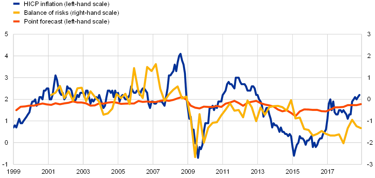
Sources: SPF and ECB staff calculations.
Note: Positive values of the balance of risks indicator denote that the balance of risks is tilted towards higher inflation outcomes, while negative values denote that the balance of risks is tilted towards lower outcomes.
Box 5 Using probability distributions to measure the balance of risks
A probability distribution for a future outcome forms a complete representation of the forecast. The probability distribution function (PDF) provides the information needed to summarise all aspects of the forecast: the central point forecast, how uncertain that is, whether the balance of risks is seen as more to the upside or downside, and the probabilities of outcomes in given ranges. In practice, the accuracy of such metrics depends on how precisely the PDF is specified.
In theory, how a forecaster summarises the underlying probability distribution as a single point forecast depends on that forecaster’s view on forecast errors. More formally, forecasting theory shows that the optimal point forecast corresponding to a given PDF is the one which minimises the forecaster’s loss function associated with possible forecast errors:
The loss function, L, is a mathematical expression which describes how much the forecaster would care about different-sized forecast errors. Thus, even if different forecasters had the same view on the underlying distribution of possible future outturns, if they had different loss functions they would give different point forecasts. Three types of loss function are typically considered in economics. The first is the uniform loss function: all forecast errors are equally bad, regardless of their size. In this case, the optimal point forecast is the distribution’s mode, which corresponds to the most likely outcome. The second loss function increases linearly with the size of the forecast error, i.e. if the forecast error is twice as large, then that is twice as bad. In this case, the optimal point forecast is the median, where the probability of an upside error is the same as the probability of a downside error. The third is the quadratic loss function, which penalises larger forecast errors even more severely: if the forecast error is twice as large, then that is four times as bad. In this case, the corresponding point forecast is the distribution’s mean.
Similarly, the statistical measure of asymmetry that best represents the balance of risks around a point forecast also depends on the forecaster’s view on forecast errors. The extent to which risks around the point forecast are in one direction or another depends on the asymmetry of the forecast PDF: for a symmetric PDF the risks are balanced. Just as forecast theory defines the optimal forecast, it defines the balance of risk as the balance of conditional expected loss:
In cases where the loss function itself is symmetric (such as the three described above), i.e. an upside error and a downside error of the same magnitude would be equally undesirable, the balance of risks measures, in the event that a forecast turns out to be wrong, in which direction the forecaster considers it more likely to be wrong. For instance, a positive balance of risks indicates that the forecaster believes that, were the forecast to be wrong, it would more likely be because the outturn was above the forecast than below it. The equation above can be combined with the different loss functions to show that the appropriate measure of asymmetry is the balance of total probability either side of the mode in the case of uniform loss, the quartile skewness in the case of linear loss, and skewness in the case of mean squared loss.
In the context of the SPF, where probabilities are reported for a discrete set of fairly wide intervals, there are a number of alternative ways of evaluating the different statistical asymmetry measures. For example, the interval probabilities supplied in the SPF represent a set of points along the cumulative distribution function, and different interpolation schemes can be used to convert these into a continuous function. In addition, an assumption needs to be made about where to place the points corresponding to the two open probability intervals and the upper and lower ends of the range of plausible outcomes.
All combinations of statistical measures and alternative calculation practices can be brought together in a balance of risk indicator suite. These measures all tend to co-move strongly and can be distilled into a simple summary statistic by taking their unweighted average.[19]
5 What can we learn from longer-term expectations?
Longer-term expectations in the SPF may provide information on professional forecasters views on the steady state of the economy. The steady state is important because this is what the economy reverts to once the effects of past and current shocks have died out and can evolve in line with structural trends in the economy. In the SPF, the longer-term horizon corresponds to a horizon about five years ahead. It might be reasonable to assume that most shocks hitting the economy are not that persistent, and so, by that horizon, the impact of any shock should have faded. If this were the case, then longer-term expectations should reflect only a view on the structural characteristics of the economy, such as the potential growth rate or the NAIRU.
However, the answers to the 2018 special survey suggest that the picture is more nuanced, i.e. that some shocks might be very persistent. SPF participants were asked to clarify how their long-term forecasts should be interpreted. While many respondents said that their long-term expectations did have a structural interpretation, even more said that this was only sometimes the case, and some suggested in their qualitative comments that the impact of some shocks may be more persistent, in which case five years would not be enough to return to the steady state (see Table 1). Indeed, the average longer-term unemployment rate expectations of those responding “no” to a NAIRU interpretation do appear to be more cyclical than for those responding “always”.
Table 1
Correspondence between SPF longer-term expectations and structural characteristics
(number of respondents)

Source: SPF special survey, 2018.
The impact of perceived persistence of shocks is most visible in the evolution of long-term unemployment expectations. The sharp increases in actual unemployment and short-term unemployment expectations in the aftermaths of the financial and sovereign debt crises were also accompanied by significant upward revisions of long-term expectations (see Chart 11). Such a link between expectations across horizons can be explained using the concept of hysteresis, whereby temporary demand or supply-driven increases in unemployment can, for instance via duration effects, have persistent effects in terms of a higher equilibrium unemployment rate. In this respect, the survey results for the last few years suggest that forecasters also allow hysteresis to work symmetrically: the decline in short-term expectations since 2013 was accompanied by a decline in long-term expectations in roughly the same proportion as the previous upward movements. As a result, the long-term unemployment expectations display more cyclicality than would normally be expected from structural unemployment.
Chart 11
Unemployment rate expectations and revisions to unemployment rate expectations
(percentages of the labour force)

Source: SPF.
Note: The upper panel shows the aggregate one-year-ahead and five-year-ahead unemployment expectations. The lower panel shows the revisions to unemployment rate expectations: revisions to the aggregate longer-term unemployment expectations are plotted on the x-axis and revisions to aggregate one-year-ahead expectations from the corresponding survey round are plotted on the y-axis. The blue and yellow lines in the lower panel capture the trend of the two sub-samples shown.
The extent to which longer-term inflation expectations remain anchored to the central bank’s target can indicate confidence in the central bank achieving its target. The degree of inflation anchoring can be measured in different ways. These are often based on the sensitivity of longer-term expectations to short-term developments, such as the element of surprise in data outturns, or shorter-term expectations. This was comprehensively assessed in the report of the Low Inflation Task Force.[20]
Data from the quarterly survey suggest that euro area inflation expectations are well anchored. Over the last twenty years the longer-term inflation expectations in the SPF have been in the range of 1.8 to 2.0%, a range which could be interpreted as broadly consistent with the ECB’s objective of keeping inflation below, but close to, 2%. Moreover, longer-term expectations have been more stable than the average HICP inflation rate, which might otherwise have been taken as a guide to inform a naïve, backward-looking forecast (see Chart 12). In recent years, longer-term inflation expectations have been gradually and steadily recovering from the low recorded in the first quarter of 2015, i.e. the survey round prior to the announcement of the public sector purchase programme. In the fourth quarter of 2018 survey round, the longer-term expectation for HICP inflation stood at 1.9% and the longer-term expectation for HICP inflation excluding energy, food, alcohol and tobacco stood at 1.8%. However, forecasters’ balance of risks around longer-term inflation expectations still remains clearly skewed to the downside, as it has been since the sharp fall in annual inflation in the second half of 2008, although it has been improving.
Chart 12
Longer-term inflation expectations and the balance of risks around them
(left-hand scale: annual percentage changes; right-hand scale: balance of risks indicator)

Sources: SPF and ECB staff calculations.
Notes: The expanding average series denotes the average annual HICP inflation rate from January 1999 to the date indicated on the x-axis. Negative values of the balance of risks indicator denote that the balance is to the downside, while positive values denote that the balance is to the upside.
The ECB’s inflation objective has remained the key factor informing SPF respondents’ longer-term expectations. The 2018 special survey repeated a question from 2013, asking survey participants what information they used to inform their longer-term inflation expectations. Relative to the previous survey, there were notable increases in the shares of respondents indicating the ECB’s inflation objective, trends in financial market based measures of inflation expectations and trends in wages, whereas there were notable declines in the shares of respondents indicating trends in monetary aggregates and other variables (see Chart 13). Given that trends in actual inflation, wages and longer-term market expectations have clearly weakened in recent years, the role of the inflation objective as an anchor of expectations has been brought to the fore.
Chart 13
Factors informing SPF respondents’ longer-term expectations
(percentages of respondents)

Sources: SPF and ECB staff calculations.
Notes: The option “fiscal variables” was not offered as a possible response in 2013, although fiscal variables were mentioned by some respondents answering “other variables”. It is therefore also included in “other variables” in the 2018 figures. Percentages do not add up to 100 because respondents could indicate multiple factors.
6 Conclusions
The ECB’s SPF is the most long-standing, comprehensive and transparent survey of the aggregate euro area economy. In particular, relative to other surveys, the PDFs in the SPF allow a complete, quantitative evaluation of perceived risks to and uncertainty surrounding the outlook. This provides an additional valuable dimension to complement the point forecasts and form a more complete economic assessment of the information received in the quarterly survey, for example when considering the pace and nature of the economic normalisation following the financial crisis.
It is helpful as a cross-check not only of the ECB’s/Eurosystem’s own macroeconomic projection profiles but also of the fundamental economic relationships underpinning them. The twenty years of the SPF have generated a rich dataset which can be used to address topical economic questions and help inform monetary policy debate. For example, considering the SPF data for different variables together, we can deduce how the professional forecasting community assesses the relationships between key variables, such as growth and inflation or unemployment and wage growth, to be evolving. Thus, the SPF remains as useful for economic analysis and as relevant to monetary policy debate today as it was when it was first launched twenty years ago.
- For more information on market-based measures, see the article entitled “Interpreting recent developments in market‑based indicators of longer‑term inflation expectations”, Economic Bulletin, Issue 6, ECB, 2018.
- For further information, see the report on the results of the 2018 special survey.
- See Bowles, C., Friz, R., Genre, V., Kenny, G., Meyler, A. and Rautanen, T., “An Evaluation of the Growth and Unemployment Forecasts in the ECB Survey of Professional Forecasters”, OECD Journal: Journal of Business Cycle Measurement and Analysis, Vol. 2010/2, OECD, December 2010; Grothe, M. and Meyler, A., “Inflation Forecasts: Are Market-Based and Survey-Based Measures Informative?”, International Journal of Financial Research, Vol. 9(1), January 2018; and Genre, V., Kenny, G., Meyler, A. and Timmermann, A., “Combining expert forecasts: Can anything beat the simple average?”, International Journal of Forecasting, Vol. 29(1), January-March 2013, pp. 108-121.
- See Abel, J., Rich, R., Song, J. and Tracy, J., “The Measurement and Behaviour of Uncertainty: Evidence from the ECB Survey of Professional Forecasters”, Journal of Applied Econometrics, Vol. 31(3), April/May 2016, pp. 533-550; Łyziak, T. and Paloviita, M., “Anchoring of inflation expectations in the Euro Area: Recent evidence based on survey data”, European Journal of Political Economy, Vol. 46(C), January 2017, pp. 52-73; Rich, R. and Tracy, J., “A Closer Look at the Behaviour of Uncertainty and Disagreement: Micro Evidence from the Euro Area”, Working Papers, No 1811, Federal Reserve Bank of Dallas, July 2018; and Glas, A. and Hartmann, M., “Inflation uncertainty, disagreement and monetary policy: Evidence from the ECB Survey of Professional Forecasters”, Journal of Empirical Finance, Vol. 39(B), December 2016, pp. 215-228.
- See Beechey, M.J., Johannsen, B.K. and Levin, A.T., “Are Long-Run Inflation Expectations Anchored More Firmly in the Euro Area Than in the United States?”, American Economic Journal: Macroeconomics, Vol. 3(2), April 2011, pp. 104-129; Grishchenko, O., Mouabbi, S. and Renne, J.-P., “Measuring Inflation Anchoring and Uncertainty: A US and Euro Area Comparison”, Finance and Economics Discussion Series, No 102, Board of Governors of the Federal Reserve System, 2017; and Dovern, J. and Kenny, G., “Anchoring Inflation Expectations in Unconventional Times: Micro Evidence for the Euro Area”, working paper featured at the ECB conference on "Understanding inflation: lessons from the past, lessons for the future?", September 2017.
- See Frenkel, M., Lis, E.M. and Rülke, J.-C., “Has the economic crisis of 2007-2009 changed the expectation formation process in the Euro area?”, Economic Modelling, Vol. 28(4), July 2011, pp. 1808-1814; and Reitz, S., Rülke, J.-C. and Stadtmann, G., “Nonlinear expectations in speculative markets – Evidence from the ECB survey of professional forecasters”, Journal of Economic Dynamics and Control, Vol. 36(9), September 2012, pp. 1349-1363.
- See Ciccarelli, M. and Osbat, C. (eds.), “Low inflation in the euro area: Causes and consequences”, Occasional Paper Series, No 181, ECB, January 2017.
- The results also confirm findings by López-Pérez, V., “Do professional forecasters behave as if they believed in the New Keynesian Phillips Curve for the euro area?”, Empirica, Vol. 44, No 1, 2017, pp. 147-174.
- For possible factors driving the change in the relationship, see the article entitled “The employment-GDP relationship since the crisis”, Economic Bulletin, Issue 6, ECB, 2016.
- The specification using long-term expectations omits the forward-looking part of the New Keynesian Phillips curve owing to data constraints, i.e. the regression is given by
- See the box entitled “Recent wage trends in the euro area”, Economic Bulletin, Issue 3, ECB, 2016.
- See the box entitled “What can we learn from the ECB Survey of Professional Forecasters about perceptions of labour market dynamics in the euro area?”, Economic Bulletin, Issue 8, ECB, 2017.
- See D’Agostino, A., McQuinn, K. and Whelan, K., “Are Some Forecasters Really Better Than Others?”, Journal of Money, Credit and Banking, Vol. 44, No 4, June 2012, pp. 715-732. This approach also has the advantage that it (i) mimics the unbalanced nature of the SPF, (ii) replicates the participation of each forecaster, and (iii) only reallocates errors intra-period not inter-period. Other papers that have looked at the issue of forecaster performance (e.g. Stekler, H., “Who Forecasts Better?”, Journal of Business & Economic Statistics, Vol. 5, No 1, January 1987, pp. 155-158; and Batchelor, R.A., “All Forecasters Are Equal”, Journal of Business & Economic Statistics, Vol. 8, No 1, January 1990, pp. 143-144) have relied on balanced panels and, in some cases, utilised rank, which does not take into account the size of forecast errors.
- To avoid forecasters with only a few forecasts having a disproportionate impact on the results, we only consider forecasters who have provided at least 20 forecasts (i.e. the equivalent of five-years) for a given variable/horizon. This leaves us with between 63 and 77 forecasters, depending on the variable/horizon.
- We assess relative forecast performance using a statistic (the squared error statistic scaled by the mean squared error) that (a) penalises larger errors, (b) controls for difficult to forecast variables/horizons/periods, and (c) allows us to aggregate across variables and horizons.
- The twelve permutations are the result of having three variables (HICP, GDP and unemployment), two horizons (one year and two years ahead) and two sample periods (pre-crisis and post-crisis).
- This confirms findings in Genre, V., Kenny, G., Meyler, A. and Timmermann, A., op. cit.
- Over the twenty years of the survey, the range of outcomes spanned by the closed intervals has been updated in response to developments in the data.
- For more information, see the box entitled “How do professional forecasters assess the risks to inflation?”, Economic Bulletin, Issue 5, ECB, 2017.
- See Ciccarelli, M. and Osbat, C. (eds.), op. cit.