
- THE ECB BLOG
- 22 June 2020
The market stabilisation role of the pandemic emergency purchase programme
Blog post by Philip R. Lane, Member of the Executive Board of the ECB
March 2020 was a pivotal month in the escalation of the economic and financial dimensions of the pandemic crisis.[1] As it became clear that the scale and speed of the spread of the virus required very extensive lockdown measures around the world, there was a sharp downward revision in the economic and financial outlook that was paired with extremely elevated uncertainty. The global financial system was put under extraordinary strain. The nature of the shock triggered an abrupt and significant desired rebalancing of portfolios, in the direction of greater liquidity and lower leverage. The collective scramble to implement this portfolio shift, with investors all looking to make similar trades, put pressure on market-making financial intermediaries and was associated with a widespread dash for cash. This ran the risk of forced fire sales in many asset markets, illiquidity spirals (with the joint loss of market liquidity and funding liquidity) and the discontinuities associated with market freezes.
Under these conditions, liquidity provision and asset purchases by central banks can limit self-fulfilling overshooting dynamics and the associated risks to financial stability. Generous access to central bank refinancing facilities enables intermediaries to tap liquidity without having to sell their asset holdings. Asset purchases by the central bank (of both sovereign and private-sector securities) have a reach that goes beyond the provision of liquidity to banking intermediaries, by acting as a counterweight to one-sided market pressures. In particular, asset purchasing by a central bank “crowds in” other investors by providing the reassurance that self-fulfilling market instability risks will be contained by the stabilising presence of the central bank.
In a monetary union that lacks an area-wide common safe asset, flight-to-safety episodes also have a geographic dimension, in view of the high substitutability across national financial systems that is generated by the absence of currency risk. The nature of such episodes is that heightened risk aversion not only involves a reassessment of the pricing of fundamentals-based risks but also may induce a withdrawal to so-called safe haven jurisdictions in the belief that other investors may also opt to make the same geographic reallocation decision.
In the absence of active market stabilisation by the central bank, the intrinsic self-validating nature of flight-to-safety dynamics creates the risk of asset price movements and cross-border financial flows that, in terms of their magnitude, are unwarranted by fundamentals, but that also reflect a switch across multiple self-fulfilling beliefs-driven equilibria.
While it is always challenging to distinguish between fundamentals-driven and beliefs-driven repricing and reallocation dynamics (especially in real time), the specific circumstances of the pandemic crisis suggest that there was a compelling case for the central bank to act as a market stabiliser. First, as outlined above, it was clear that flight-to-safety pressures were operating at a global level, with the risk of a broad disconnect between asset prices and fundamentals across many markets. Second, the nature of the shock (a worldwide pandemic) meant that concerns about moral hazard were more attenuated than in some other scenarios.
In response, the ECB acted through its liquidity operations and the setting-up of the pandemic emergency purchase programme (PEPP). The PEPP has a dual role. First, together with the other components of the monetary policy framework, extra asset purchases are an important mechanism to deliver the monetary accommodation required to ensure that medium-term price stability is protected by supporting the economic recovery from the pandemic crisis. Second, the flexible nature of the PEPP across time, asset classes and jurisdictions is designed to fulfil the market stabilisation role in an efficient manner, especially in view of the high uncertainty associated with the effects of the pandemic across different asset markets and the individual euro area countries.
It is now three months since the PEPP was launched. With last week’s release of the April data for the balance of payments, it is now possible to look back and review some of the data from the pre-PEPP and initial post-PEPP phases.
Chart 1 plots the composite indicator of systemic stress (CISS) in the euro area financial system. The CISS clearly shows a sharp increase in systemic stress in the first half of March of this year.
Euro area composite indicator of systemic stress (CISS)
(percentages per annum)
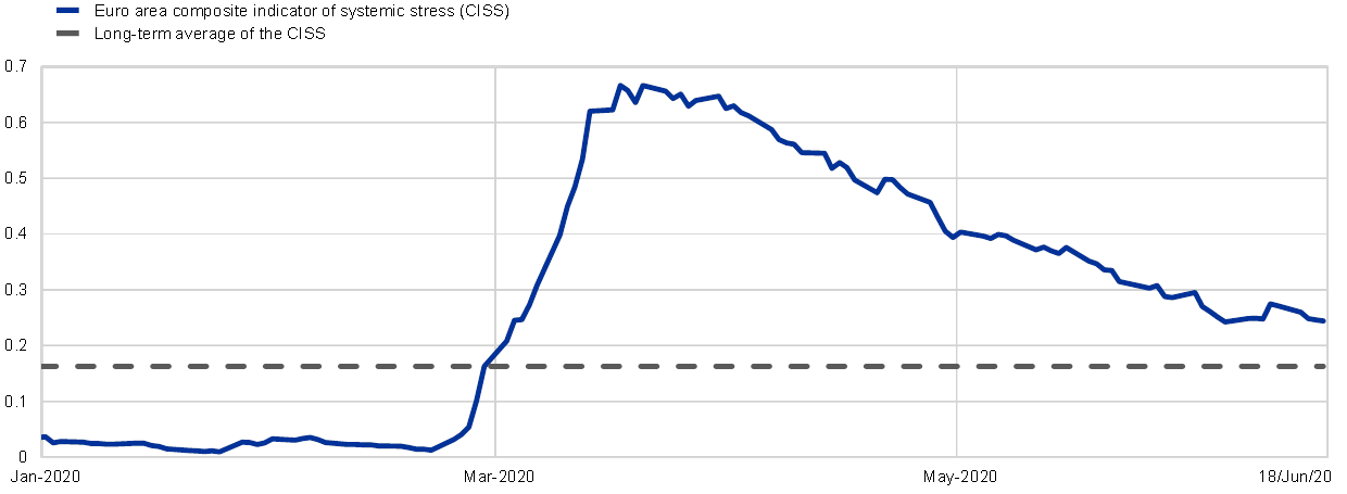
Sources: ECB, Refinitiv, own calculations and Hollo, Kremer and Lo Duca: ECB Working Paper No. 1426, March 2012.
Notes: The long-term average is calculated over the period 1999-2020.
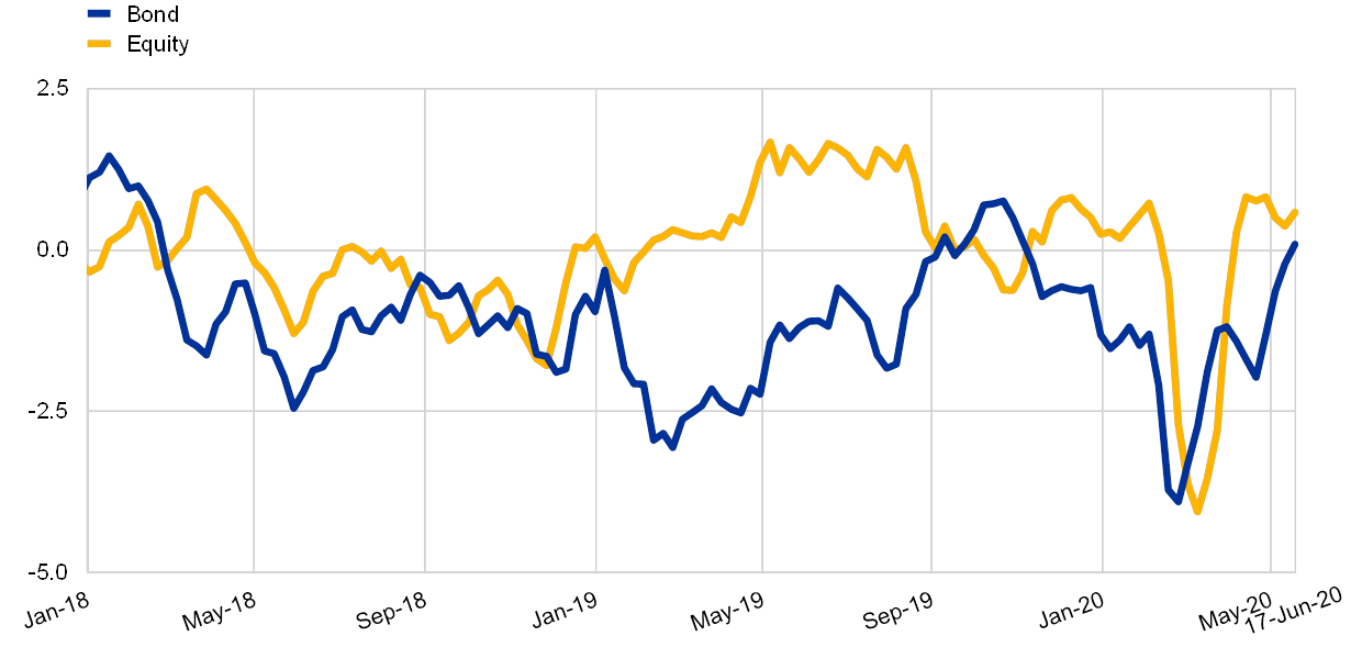
In relation to private securities, Charts 2 and 3 show the adverse dynamics of corporate bond yields and the stock market index during this period. The market stress also extended to the interbank market, as illustrated by the behaviour of the EURIBOR in Chart 4.
Corporate bond spreads in the euro area
(basis points)

Source: Markit iboxx.
Euro Stoxx index
(rebased to 100 on 1 January 2020)
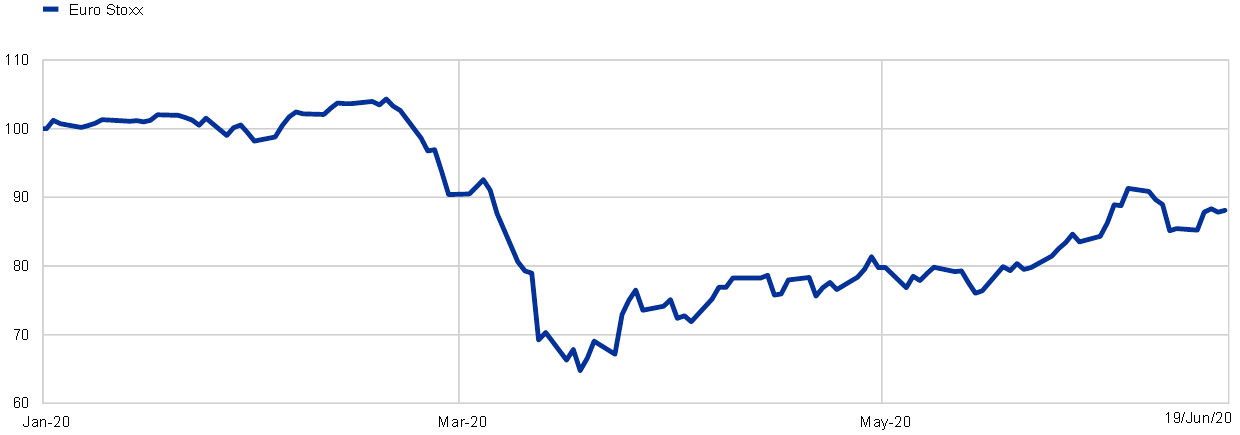
Sources: Bloomberg and ECB calculations.
3-month Euribor and 3-month overnight index swap (OIS) rates
(percentages per annum)

Sources: Bloomberg and ECB calculations.
Chart 5 shows the output-weighted average ten-year sovereign bond yield, expressed in terms of the deviation from the ten-year overnight index swap (OIS) rate. Sovereign bond yields are central to determining financial conditions in each Member State: Charts 6 and 7 show the high correlation between the funding conditions facing banks and corporates and sovereign bond yields. Accordingly, the widening in the gap between the average sovereign yield and the OIS rate in March suggested that fragmentation pressures were increasing. This is reinforced by the pattern in Chart 8, which shows an increase in the contribution of a segmentation indicator in accounting for the joint behaviour of sovereign yields during this period.[2]
GDP-weighted 10-year euro area sovereign yield spread over 10-year OIS rate
(basis points)

Sources: Refinitiv and ECB calculations.
Notes: The spread is the difference between the euro area GDP-weighted 10-year sovereign yield and the 10-year OIS rate.
Bank and sovereign bond yields
(daily; percentages per annum; x-axis: sovereign yields; y-axis: bank bond yields)

Sources: Markit iboxx, ECB and ECB calculations.
Notes: The chart reports the correlation between (level of) bank bond yields and sovereign yields. Each dot corresponds to a daily recording of the average yield for senior unsecured bonds (IG) issued by banks with a given maturity in a given country and the sovereign yields with the same maturity for the same day in the same country.
Latest observation: 18 June 2020.
Corporate and sovereign bond yields
(daily; percentages per annum; x-axis: sovereign yields; y-axis: corporate bond yields)

Sources: Markit iboxx, ECB and ECB calculations.
Notes: The chart reports the correlation between (level of) corporate bond yields and sovereign yields. Each dot corresponds to a daily recording of the average yield for senior unsecured bonds (IG) with a given maturity issued by non-financial corporates in a given country and the sovereign yields with the same maturity for the same day in the same country.
Latest observation: 18 June 2020.
Average R-squared of 10-year sovereign spreads on the first two principal components

Sources: Refinitiv and ECB calculations.
Notes: The regressions are in first differences. The length of the rolling windows is 99 days, which corresponds to 4 months (of 22 trading days each) and a half of data, so that the last estimated R-squared covers the coronavirus crisis period from mid-January to end May. The average R-squared reported for the second principal component (PC) is the average difference between the R-squared of the regression on the first PC and the R-squared of regressions on the first and second PCs.
Across these various asset price indicators, the common pattern is that of a significant de-escalation in market tensions after the mid-March market stabilisation measures taken by the ECB (PEPP; refinancing operations; collateral-easing measures). Since Chart 9 shows that the macroeconomic projections continued to deteriorate throughout April and May, the improvement in market conditions cannot be attributed to a general boost in the outlook. Rather, it is plausible that central bank interventions played an important contributory role. In the euro area context, the further improvement in conditions in recent weeks can also be attributed to the increasing likelihood of an EU-level fiscal response to the crisis that will act to contain the tail risks facing individual member countries.
GDP projections for Q2 2020
(quarter-on-quarter percentage change)

Source: Bloomberg and ECB staff calculations.
Notes: Mean of forecasts revised on the last business days.
Latest observation: Dates for the ECB/Eurosystem staff (broad) macroeconomic projection exercise (MPE) refer to the cut-off dates rather than the publication dates: 28 February 2020 for the March MPE, 27 April for the ECB scenarios published on 1 May 2020 (see Battistini, N. and Stoevsky, G. (2020), “Alternative scenarios for the impact of the COVID-19 pandemic on economic activity in the euro area”, Economic Bulletin, Issue 3, European Central Bank), and 25 May for the June BMPE.
As is displayed in Charts 10 and 11, the March and April balance of payments data show a basic asymmetry across the member countries of the euro area. If the member countries are divided into two groups (less vulnerable and more vulnerable), the March data show that cross-border investors were net sellers of the debt liabilities of the more vulnerable group and net buyers of the debt liabilities of the less vulnerable group. This configuration is consistent with the nature of a flight-to-safety episode. Although this basic pattern is also found in the April data, the extent of the net selling of the debt liabilities of the more vulnerable group is much less severe than in the March data.
Cross-border portfolio investment flows by country group – assets
(monthly flows in % of euro area GDP)
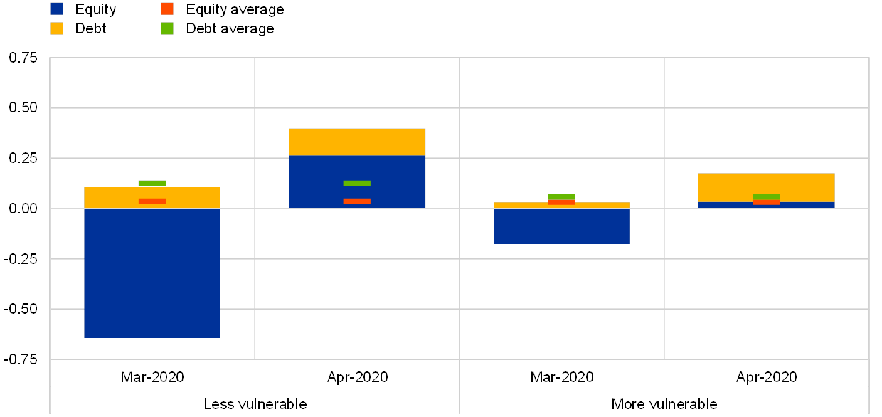
Sources: ECB and Eurostat.
Notes: “Less vulnerable” countries are Austria, Belgium, Finland, France, Germany and the Netherlands; “more vulnerable” countries are Italy, Greece, Portugal and Spain. First estimates/provisional data for Spain regarding April 2020. Data recorded on the basis of the Sixth Edition of the IMF Balance of Payments Manual (BPM6).
Latest observation: April 2020.
Cross-border portfolio investment flows by country group – liabilities
(monthly flows in % of euro area GDP)

Sources: ECB and Eurostat.
Notes: “Less vulnerable” countries are Austria, Belgium, Finland, France, Germany and the Netherlands; “more vulnerable” countries are Italy, Greece, Portugal and Spain. First estimates/provisional data for Spain regarding April 2020. Data recorded on the basis of the Sixth Edition of the IMF Balance of Payments Manual (BPM6).
Latest observation: April 2020.
Across both groups, another feature of high-stress episodes is clear in the March data: net sales of foreign assets by domestic investors. However, this proved to be quite short-lived, with the April data showing the more typical pattern of net purchases of foreign assets (especially for the less vulnerable group).
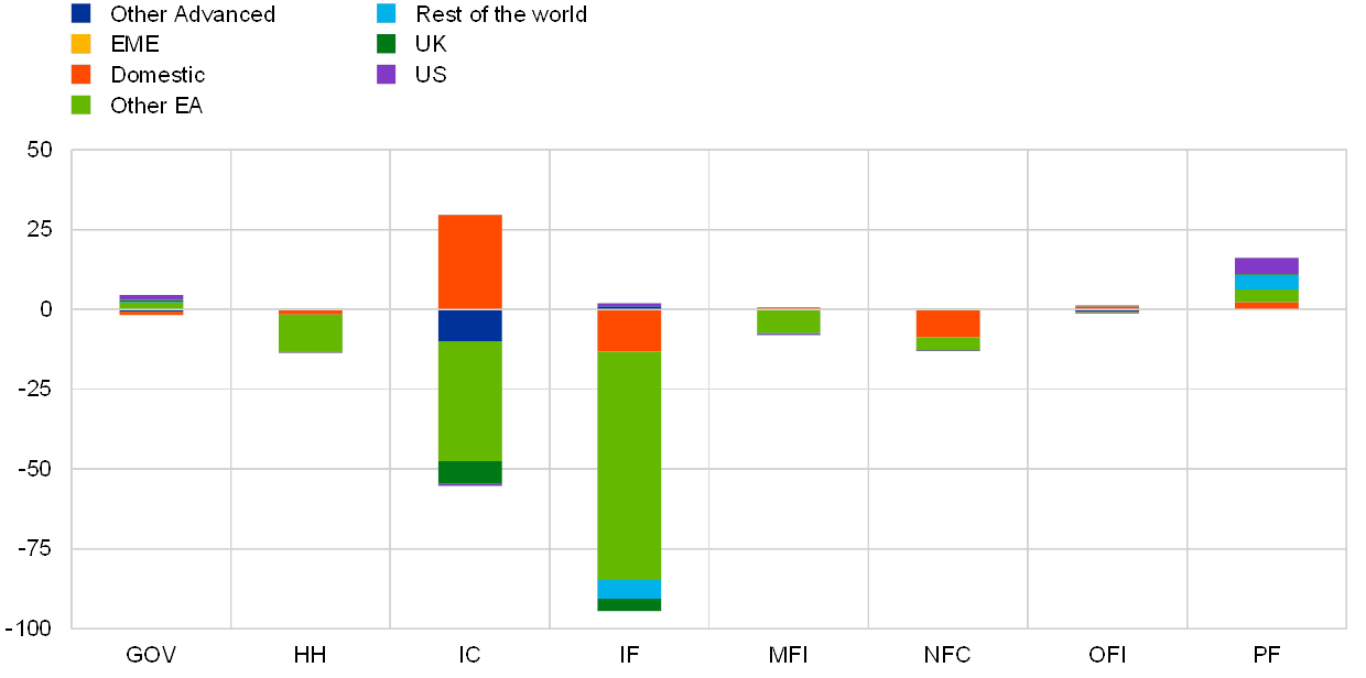
More insight into the reallocation decisions of euro area investors can be obtained by examining the shifts in the securities holdings of the various investor categories in the first quarter. Chart 12 shows that the vast bulk of the net portfolio disposals were attributable to the investment fund sector (with a relatively smaller contribution from insurance companies); in contrast, banks (monetary financial institutions – MFIs) played a counterbalancing role and were net acquirers of debt securities during this period. The relative stability of the investment positions of other sectors compared with the investment fund sector has been recognised in a variety of contexts.[3]
Portfolio asset flows by sector in 2020Q1 – euro area
(quarterly flows in EUR bn)

Source: ECB SHS.
Notes: Data for 2020Q1 are preliminary and do not include Italian insurance companies. GOV refers to public institutions; HH refers to households; IC refers to insurance corporations; IF refers to investment funds; MFI refers to monetary financial institutions; OFI refers to other financial institutions; PF refers to pension funds.
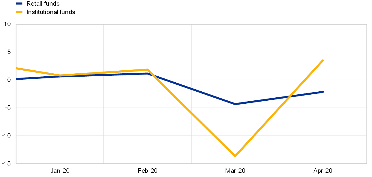
In turn, Chart 13 shows that the primary sectors disposing of investment fund shares were other investment funds (illustrating the interconnected nature of the investment fund sector) and insurance companies. The primary role of institutional investors in the sell-off is also clear in Chart 14, which shows that flows into retail funds were relatively more stable than flows into institutional funds. Chart 15 further confirms that the disposals of investment funds were especially concentrated on debt securities.
Portfolio asset flows (investment fund shares) by sector and country of issuance in 2020Q1
(quarterly flows in EUR bn)
Source: ECB SHS.
Notes: Data for 2020Q1 are preliminary and do not include Italian insurance companies. GOV refers to public institutions; HH refers to households; IC refers to insurance corporations; IF refers to investment funds; MFI refers to monetary financial institutions; OFI refers to other financial institutions; PF refers to pension funds. “Domestic” are flows where the holder country is the same as the issuer country; “Other EA” are euro area flows but excluding domestic flows.
Flows into investment funds domiciled in Europe excluding the United Kingdom
(monthly flows in EUR bn)
Source: EPFR.
Latest observation: April 2020.
Euro area investment fund flows - Liabilities
(5-week cumulated flows in % of estimated stocks and assets under management)
Sources: EPFR and ECB staff calculations.
Note: Country flows are flows of global investment funds to securities issued in the following euro area countries: Austria, Belgium, Finland, France, Germany, Greece, Ireland, Italy, the Netherlands, Portugal and Spain. Fund flows are investor flows to investment funds located in Europe except the United Kingdom.
Latest observation: Week ending on 17 June.
Charts 16 and 17 show significant differences in sectoral portfolio patterns across the groups of less vulnerable and more vulnerable member countries. While banks in both groups operated in a countercyclical manner, the scale of portfolio disposals by insurance companies in the less vulnerable group is especially striking. While nearly all sectors in the less vulnerable group pulled back from holding the debt issued by other euro area countries, several sectors in the more vulnerable group also disposed of domestic debt securities (including households and investment funds).
Portfolio flows by sector in 2020Q1 – less vulnerable countries
(quarterly flows in % of euro area GDP)

Source: ECB SHS and Eurostat.
Notes: “Less vulnerable” countries are Austria, Belgium, Finland, France, Germany and the Netherlands. Data for 2020Q1 are preliminary and do not include Italian insurance companies. HH refers to households; IC refers to insurance corporations; IF refers to investment funds; MFI refers to monetary financial institutions; OFI refers to other financial institutions; PF refers to pension funds. “Domestic” are flows where the holder country is the same as the issuer country; “EA ex dom” are euro area flows but excluding domestic flows; “Non-EA” are non-euro area flows.
Portfolio flows by sector in 2020Q1 – more vulnerable countries
(quarterly flows in % of euro area GDP)

Source: ECB SHS and Eurostat.
Notes: “More vulnerable” countries are Italy, Greece, Portugal and Spain. Data for 2020Q1 are preliminary and do not include Italian insurance companies. HH refers to households; IC refers to insurance corporations; IF refers to investment funds; MFI refers to monetary financial institutions; OFI refers to other financial institutions; PF refers to pension funds.“Domestic” are flows where the holder country is the same as the issuer country; “EA ex dom” are euro area flows but excluding domestic flows; “Non-EA” are non-euro area flows.
Taken together, Charts 10-17 capture the heterogeneity across sectors and across country groups in relation to portfolio reallocations during the first quarter. With the stabilisation of markets, we should expect to see some reversal in these patterns in the second quarter data when these become available.
In conclusion, the evidence shows that the ECB has contributed to market stabilisation. In asset markets, the significant impact of the announcement of the PEPP (together with the contributions from our other liquidity-easing measures) is consistent with a crowding-in role by which central bank intervention minimises the risks of a beliefs-driven self-fulfilling switch in equilibria. In the balance of payments data, the April monthly data show a pull back from the remarkable shifts seen in the March data.
Under the counterfactual scenario in which the central bank did not act forcefully, the pandemic shock would have been amplified by financial instability. Avoiding this outcome (which also would have been very adverse in terms of its implications for medium-term price stability) has been a central objective for the decisions of the ECB Governing Council. At this point, the future path of the pandemic and its economic implications remain highly uncertain. So it is appropriate that the Governing Council has indicated that net purchases under the PEPP will continue for the next 12 months and, in any case, until the Governing Council judges that the coronavirus crisis phase is over.
- [1]This blog post reflects the contents of my intervention at the COVID-19 webinar series organised by the Bendheim Center for Finance at Princeton University on Monday 22 June 2020 at 18:30 CET.
- [2]The segmentation indicator is based on the explanatory power of the second principal component (PC2) in explaining the joint behaviour of sovereign yield dynamics. The regressions are in first differences. The length of the rolling windows is 99 days, which corresponds to four-and-a-half months (of 22 trading days each month) of data, so that the last estimated R-squared covers the coronavirus crisis period from mid-January to the end of May. The average R-squared reported for PC2 is the average difference between the R-squared of regression on the first principle component (PC1) and the R-squared of regressions on PC1 and PC2.
- [3]For instance, Timmer (2018) shows that the investment fund sector stands out in terms of the procyclicality of flows in response to asset price movements, which he attributes to the nature of its liabilities, with ultimate investors looking to redeem shares in investment funds in response to disappointing financial news.