![All six denominations of euro banknotes are displayed vertically next to each other. The banknotes are arranged in ascending order of size and denomination, from smallest [€5] to largest [€200].](index/ECB_Website_Euro visually impaired__Bankontes-sizes.png)
Visually impaired people
“A good design for blind and partially sighted people is a good design for everybody.”
Inclusion has been the principle behind our close cooperation with the European Blind Union (EBU) since the euro design phase in the 1990s. We develop euro banknotes and coins in such a way that blind and partially sighted people can handle them with confidence.
The ECB regularly consults the EBU and did so during the development of the second series of euro banknotes, the Europa series.
Cash plays an important part in citizens’ freedom to choose how to pay and is essential for the financial inclusion of all groups in society. We want to make sure that blind and partially sighted people will continue to use euro banknotes with confidence.
Accessibility features on euro banknotes
We launched our second series of banknotes, the Europa series, between 2013 and 2019. The banknotes use the same design elements as those in the first series, but with improved accessibility features and brighter colours, which also make them easier to tell apart.
So, what are the accessibility features that you can find on the second series of euro banknotes?
Different sizes
The higher the value of a banknote, the larger it is. The €50, €100 and €200 banknotes have the same height, with the length of the note increasing as the value increases.
![All six denominations of euro banknotes are displayed vertically next to each other. The banknotes are arranged in ascending order of size and denomination, from smallest [€5] to largest [€200].](index/ECB_Website_Euro visually impaired__Bankontes-sizes.png)
Brighter colours
All denominations now have more intense and better contrasting colours. The €5 banknote is grey, the €10 is red, the €20 is blue, the €50 is orange, the €100 is green, the €200 is yellow-brown and the €500 is purple. Although the €500 banknote is no longer being issued, the €500 notes from the first series remain legal tender and can still be found in circulation.Large numerals
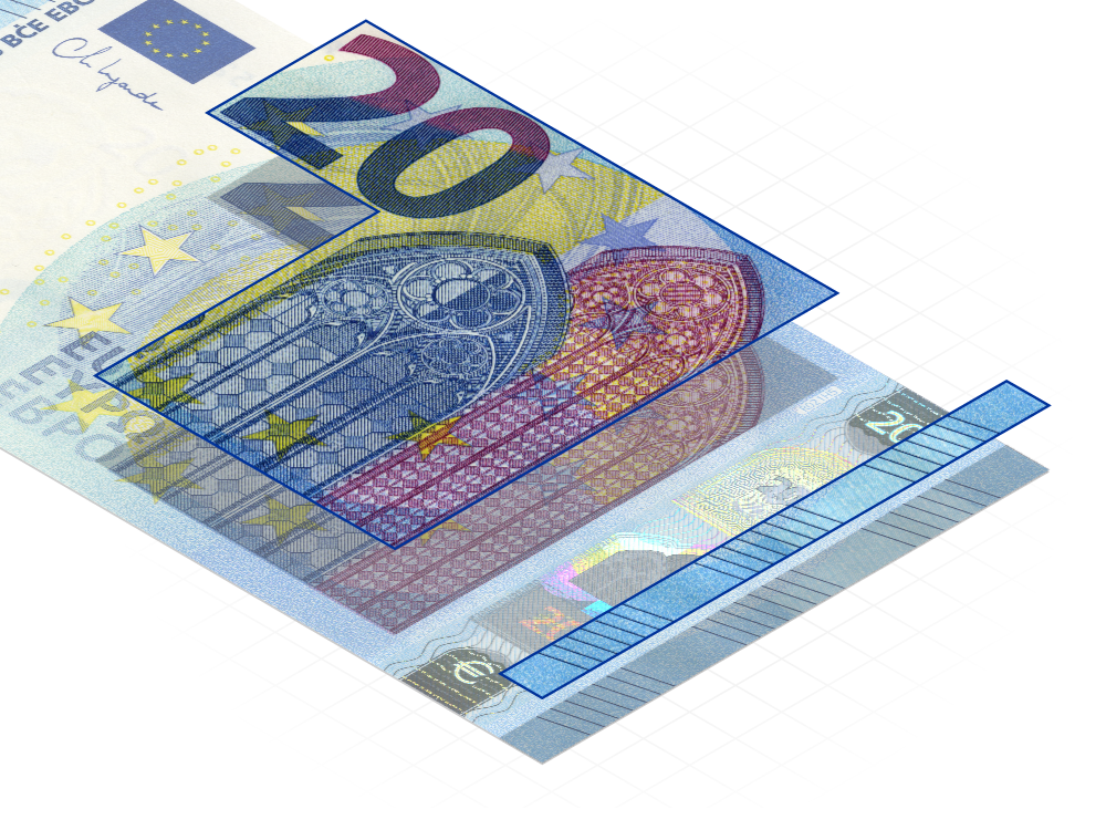
Large numerals indicating a note’s value are separated from other design elements. This increases the contrast, making it easier to recognise the value and to differentiate between all six denominations.Raised prints
The print on the large value numerals is raised. This feature makes it easier for blind and partially sighted people to identify the value of the note.

Raised lines
There are raised lines on the left and right edges of the front side of all euro banknotes. The denominations are distinguishable by the number of breaks in the raised lines as shown in the pictures below. Denominations with a similar pattern can be further differentiated by their size.
How effective are our accessibility features?
Do you want to know more about how this works in practice? Check out the video below, in which a member of the blind community explains how she recognises euro banknotes.
Access the transcript of the video.
Coins
Features include:
- Different sizes, shapes, colours and edges
- Different weights: the higher the value, the heavier the coin (except for the 50 cent coin, which is heavier than the €1 coin)
- Clearly displayed values on the common sides of the coins
If you have any questions about euro coins, please contact the European Commission.


