


Future euro banknote design proposals
Our euro banknotes are getting a new look! Designers from all over Europe have reimagined how they may look like, and ten of their proposals have been shortlisted and submitted to the opinion of the public. The Governing Council is expected to select the final design of the future euro banknotes around the end of 2026, considering the public preferences.
Browse through the shortlisted designs below


Design A - Studio Joost Grootens
The design can be explained as a reflection on how culture is formed. The eyes represent observing, sensing and reflecting, while the mouth symbolises expression, dialogue and exchange. By focusing on these elements, the portraits move beyond individual identity towards a shared human capacity for cultural production. On the reverse, contemporary cultural spaces show people of different backgrounds and ages meeting and interacting. Together, the two sides connect individual perception and expression with collective exchange, inviting the public to see the banknotes as representations of culture as a living, shared process.
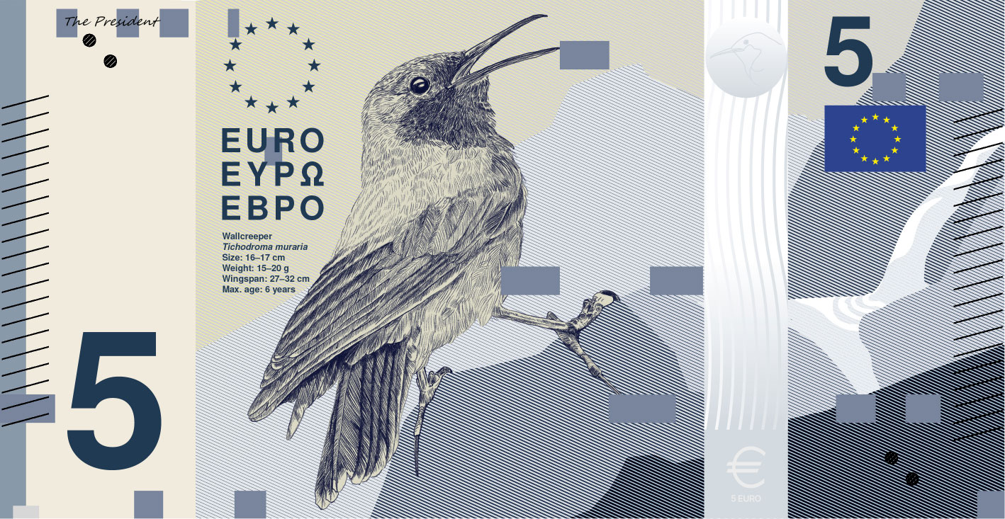

Design B - PunktFormStrich
The "Rivers and birds" banknote series communicates its concept through a direct connection between visual elements and their meaning. Each banknote presents a specific bird species in relation to its habitat, linking biodiversity with European landscapes. Horizontal bar structures translate the individual sound of each bird into a visual form, while a vertical scale indicates its flight speed, enabling an intuitive reading of the information. Concise data on the front further contextualise the species. On the reverse, EU buildings and the map of Europe establish a connection between natural environments and shared cultural identity.
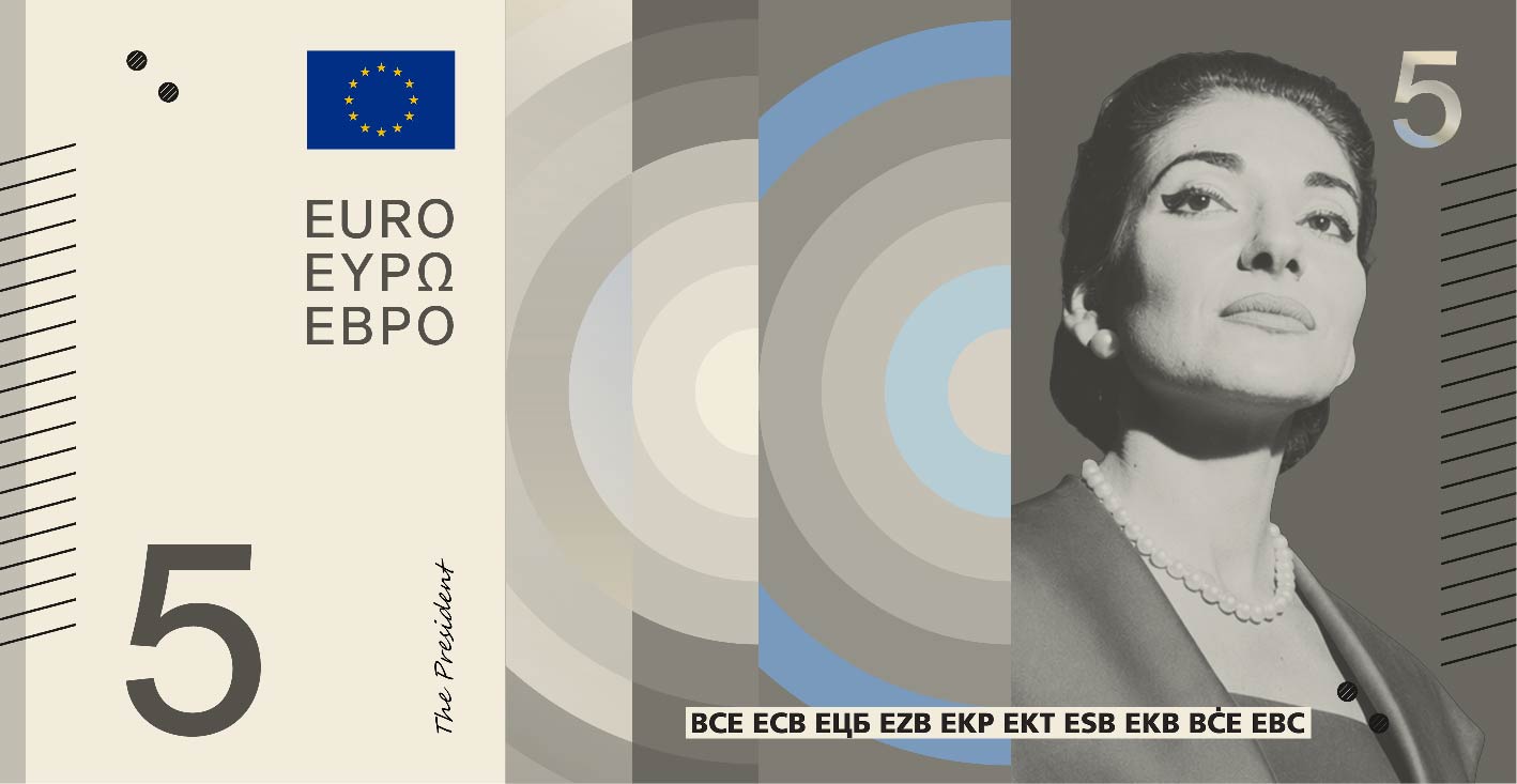

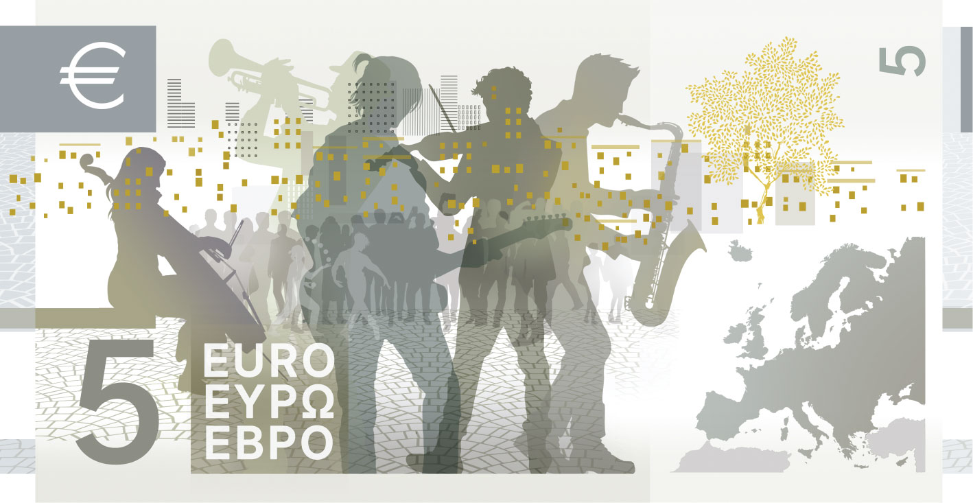
Design C - Neue Gestaltung GmbH
The design tells a simple story: Europe is a shared cultural space. Each banknote is instantly identifiable by its dominant colour and its own central motif; each portrays a personality whose life and work connects Europeans across centuries. The reverse pairs a map of Europe, lightly overlaid with the constellations that have long guided travellers, with a present-day scene of the cultural space the note represents – performing arts, music, schools, libraries, museums and public squares. People are rendered without specific features so that citizens can recognise themselves in them.

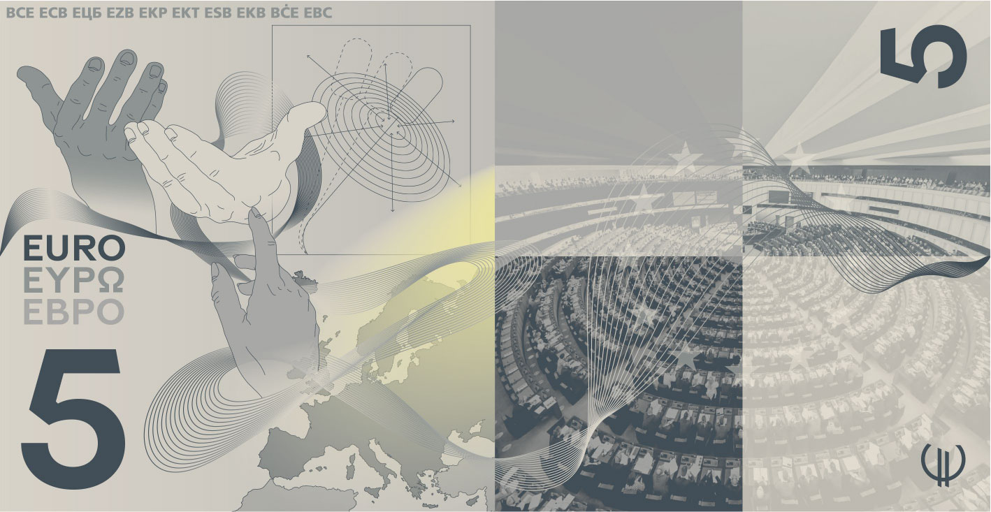
Design D - Rudy Guedj and François Girard-Meunier
Six birds appear within abstracted landscapes, connected by the continuous journey of a river, from a mountain source to a stormy sea. Light accompanies this progression, evolving from a soft presence into a dynamic, incisive force with symbolic resonance. The scenes invite close inspection, placing the viewer in the position of a birdwatcher, gathering traces of each species. On the reverse, EU institutions are expressed through human gestures and a morphing fabric-like mesh. Hands hold, stabilise, align and debate, suggesting cooperation in action, while light radiates from each building across the EU territory.

Design E - Myrsini Vardopoulou
The communicative approach focuses on the universal value of each person's work rather than their personality. The circle and the symbols function as a visual message denoting an intellectual space. This space offers the viewer immediate visual familiarity. Simultaneously, symbolic details provide subtle references for a deeper conceptual reading. In this way, the design communicates that, despite the diversity of the individuals, their contribution constitutes a unified source of inspiration and a means of reconnecting with familiar, yet ever-evolving cultural values.
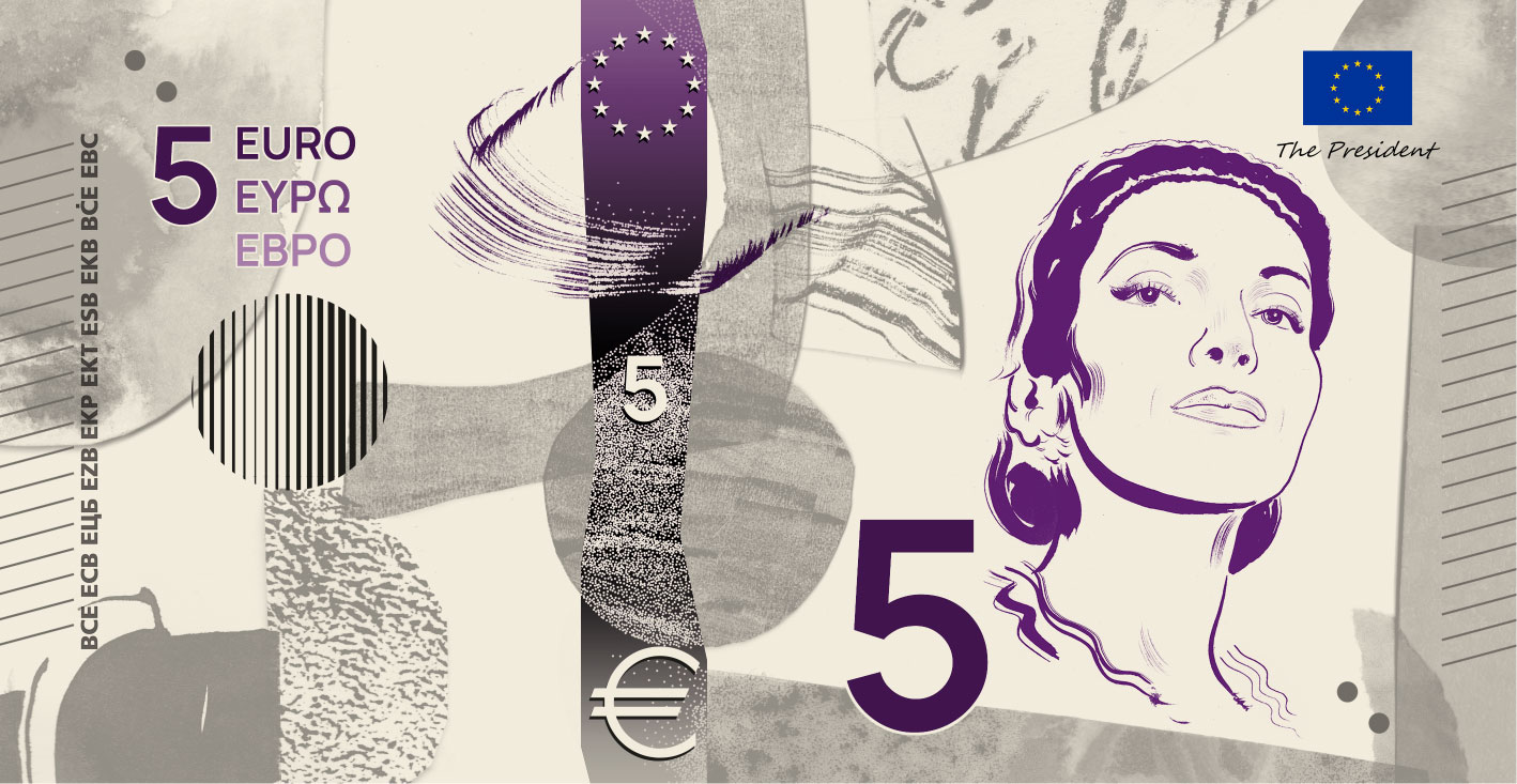

Design F - Jan Robert Dünnweller
The design aims to illustrate the official motto of the EU – "United in diversity". Europe is united by a rich shared cultural history and heritage, represented by the portraits of iconic European figures. It is united by shared values and a sense of belonging, strengthened by the diversity of cultural identities. This diversity is visualised in a collage through a multitude of forms and textures that together create a new whole, uniting these different elements. The collage forms the background for the hand-drawn portraits and depictions of shared cultural spaces as concrete manifestations of these ideas.
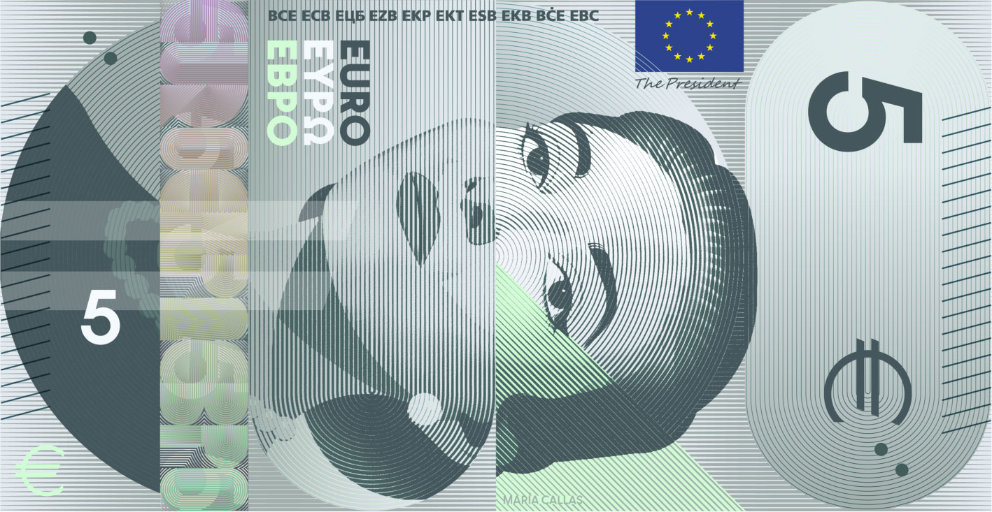
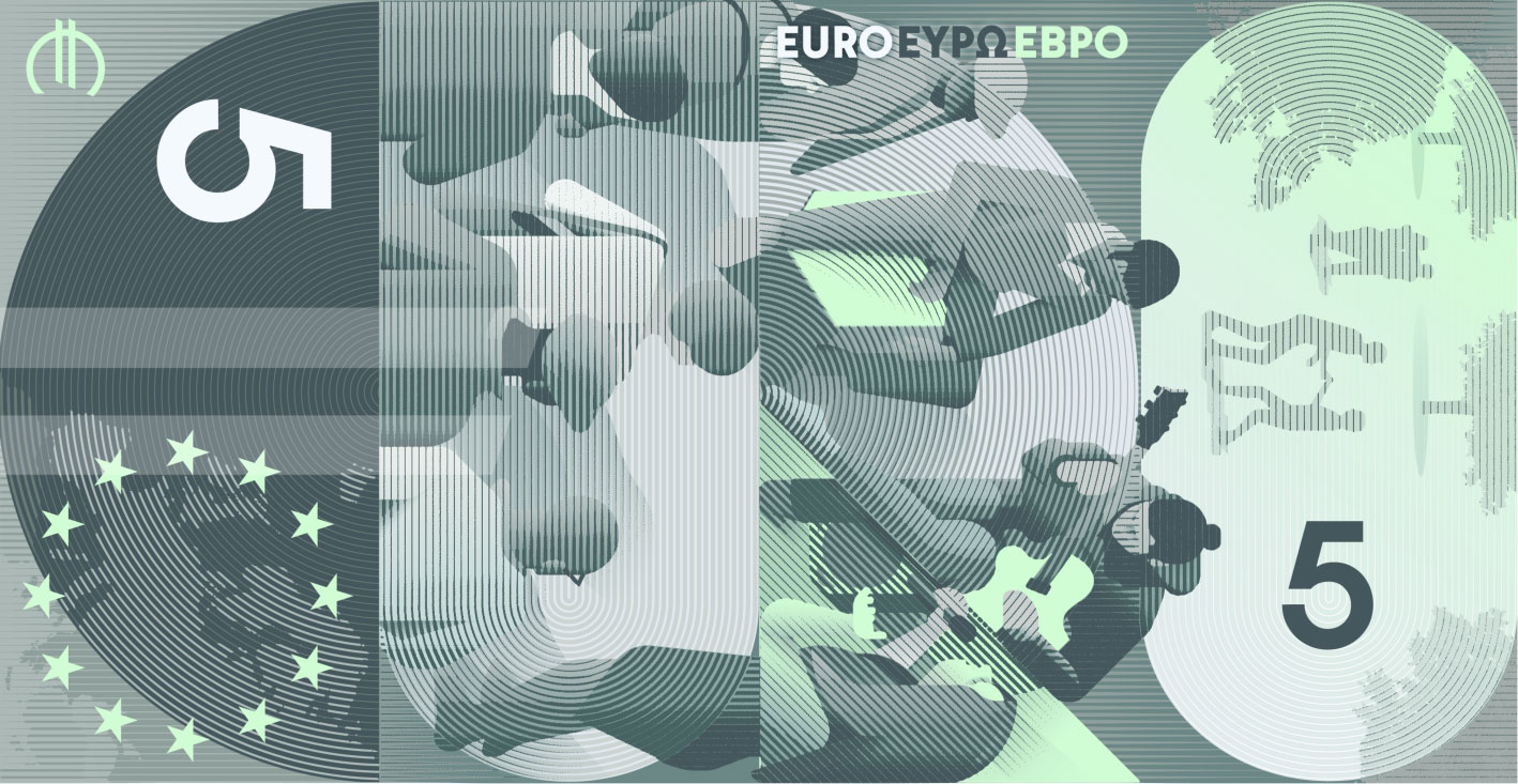
Design G - Rubio & del Amo and Cruz más Cruz
An engaging gaze meets the viewer from the centre of the banknote. It encapsulates a proposal, an idea and a dialogue between those who have forged our cultural identity and those of us who are making Europe a place at the forefront of thought, keeping the spirit of these figures alive in our daily lives. A dominant, consistent and recognisable colour meets a linear pattern that provides a shared texture, within a structure that holds the whole together. If we turn the banknotes horizontally, we see four vertical blocks, each inspired by a letter: "E", "U", "R" and "O".
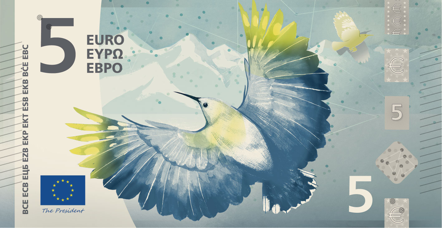
Design H - Atelier Goppel-Toperngpong
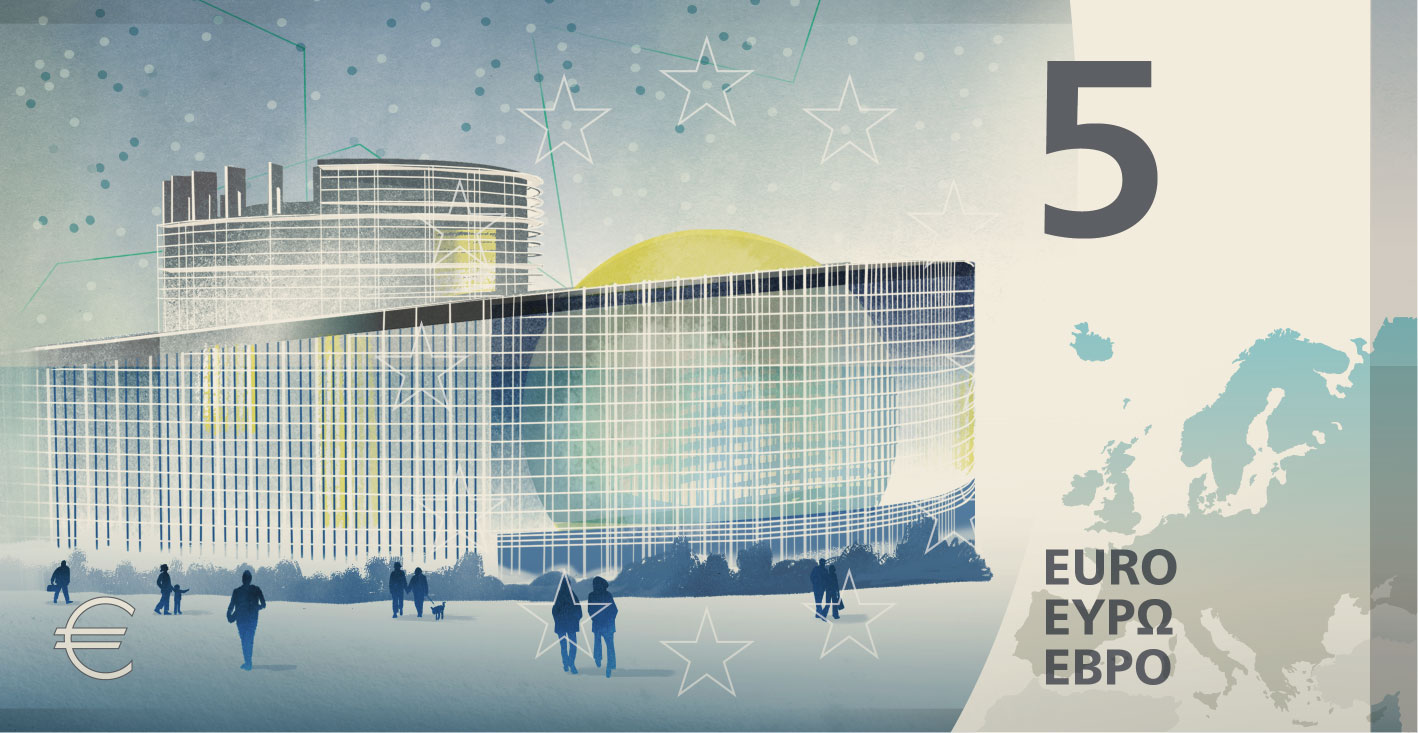
Water flows. It is the very foundation for life, shaping our environment and the habitats for the rich European birdlife depicted on the banknotes. Also, water can take on many characteristics, such as balance or consistency. Using these qualities as analogies for the EU institutions creates trust and understanding of their functions. A drop might seem negligible, but over centuries a stream is powerful enough to sculpt mountain ranges. One person might seem insignificant, but millions of people united by a common goal are resilient and powerful. In this light, water is a fitting analogy for the EU.
Design I - Isabelle Daëron
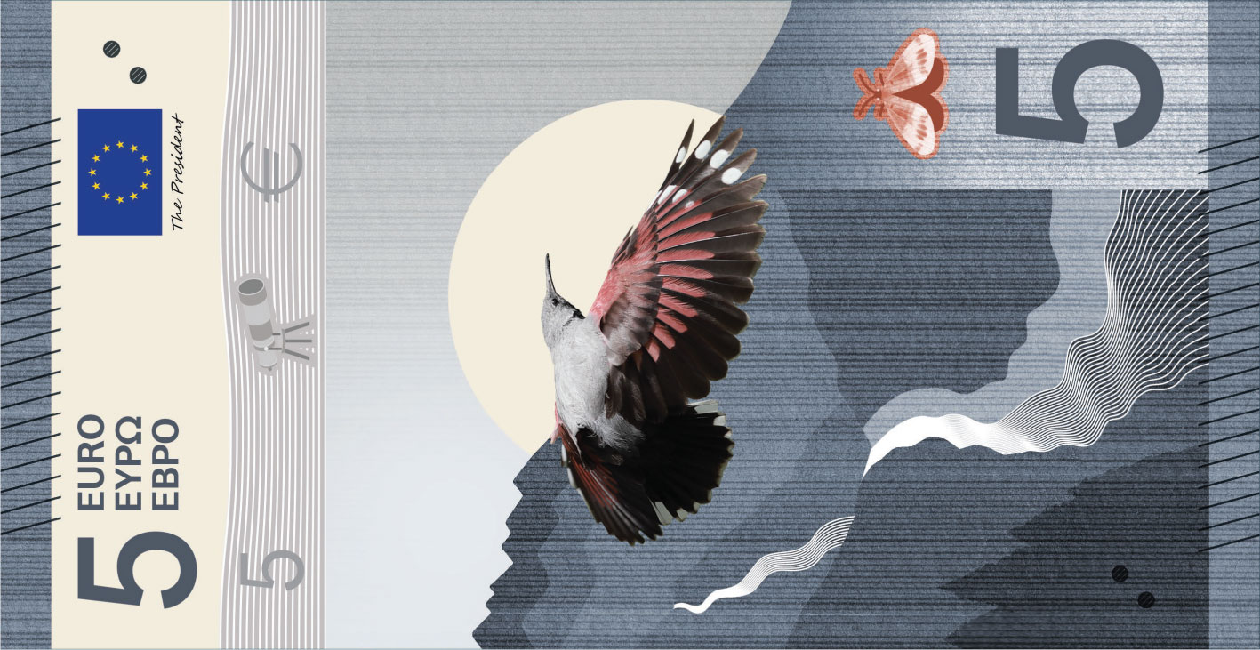
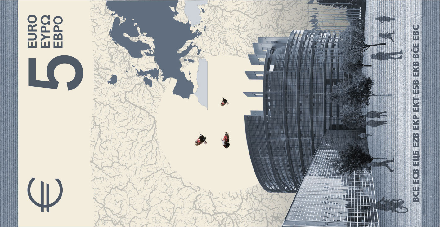
From the beat of a bird's wing to the flow of rivers, movement is at the heart of this proposal. It seeks to embody both the dynamism of the EU and the tangible and intangible flows that pass through its territory. As a true messenger, the bird – appearing alone on the front and as a group on the back – symbolises the dialogue and interdependence between our societies and nature. From a river's source to the ocean, the bird's flight reveals the landscape it traverses through the interweaving of two patterns – one hand-drawn in felt-tip pen and the other vector-based – embodying cohesion through diversity.


Design J - Ville Tietäväinen
This euro banknote series tells a visual story of European rivers, from their origins in mountain springs to merging with the sea. The main characters are the European birds in their natural habitats. The higher the banknote denomination, the closer the imagery gets to the sea. The security foils each show one phase of a river with the associated bird, and work as an infographic device, introducing the narrative concept of the banknote series. Even the EU buildings on the reverse sides of the banknotes merge with the wings of the particular birds on the front sides.
While the ECB provided guidelines for the creation of the designs, the resulting proposals are solely based on the artist's creative rendition. The ECB bears no responsibility for any elements that may or may not be included in the selected design proposals, or that any of the depicted elements will appear in the portrayed way on the final banknotes.
Terms of use
These images depict design proposals for a possible future euro banknote series. It may be used only for information, editorial and news-reporting purposes. Commercial, promotional or merchandising use, alteration, misleading presentation, or any use suggesting ECB or Eurosystem endorsement is not permitted without the ECB’s prior written authorisation. The image must be identified as a design proposal and the ECB acknowledged as the source.