Cards
This component is meant to visually highlight elements or links to other content. It can be eased to show a group of visuals or to visually link to content. Each item should have only very little text and an engaging visual.
If you need more text per item or do not have nice visuals, you should use teasers instead.
Variations
Lorem ipsum
Lorem ipsum
Lorem ipsum
Lorem ipsum
Lorem ipsum
12 January 2028
Publication title
Publication summary, lorem ipsum dolor sit amet, consectetur adipiscing elit
Lorem ipsum12 January 2028
Publication title
Publication summary, lorem ipsum dolor sit amet, consectetur adipiscing elit
Lorem ipsum12 January 2028
Publication title
Publication summary, lorem ipsum dolor sit amet, consectetur adipiscing elit
Lorem ipsum12 January 2028
Publication title
Publication summary, lorem ipsum dolor sit amet, consectetur adipiscing elit
Lorem ipsum12 January 2028
Publication title
Publication summary, lorem ipsum dolor sit amet, consectetur adipiscing elit
Lorem ipsum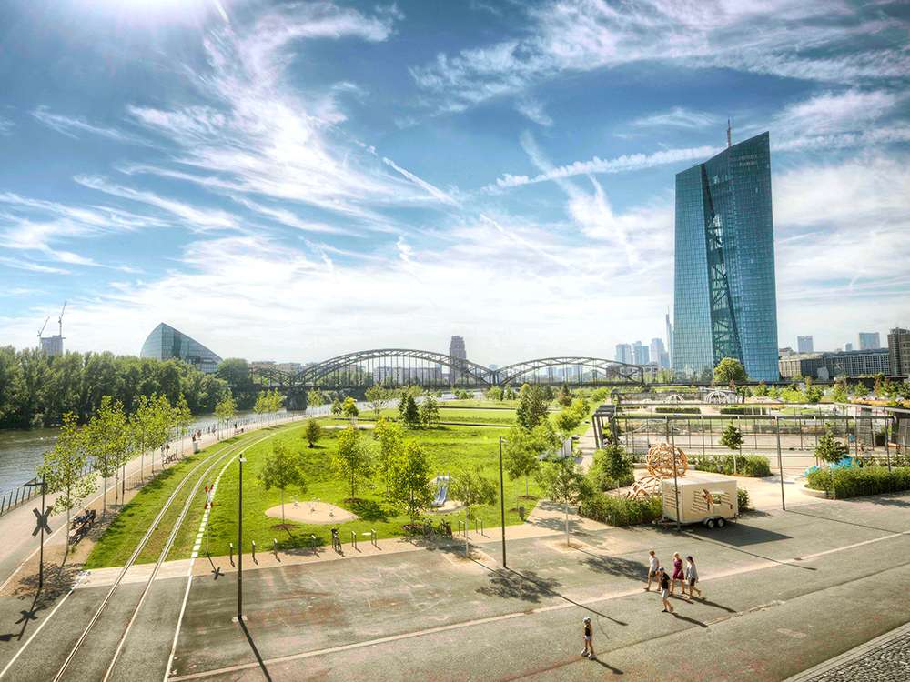
Component used in
Details
Usage
The cards component is used to group and display related content while linking to individual pages.
Unlike the teasers component, the cards component is meant to be easily scannable and should not give more details than necessary for a user to quickly determine an action.
Guidelines
- Short titles and with consistent lenght
- Do not apply a different layout for each card box, be consistent
- If you need to add more than one
div.wrappercontainer, always add between at least one of the available headers:div.main-headerand/ordiv.sub-header - A card box can be added without link
- Change
a.boxtag to adiv.boxtag
- Change
- Card boxes without a link must be the exception, never the rule
- Each card box should not be composed of more than:
- 1 heading (
div.title) - 1 image (
div[data-image]) - 1 headline (
h5) - 1 title (
h3) - 1 paragraph (
p)
- 1 heading (
- Character limits recommended:
- 45 characters for the heading (
div.title) - 75 characters for the headline (
h5) - 75 characters for the title (
h3) - 75 characters for the paragraph (
p)
- 45 characters for the heading (
- Image properties recommended:
- 800x450 (default resolution)
- 1000x420 (ultrawide resolution)
- 1000x750 (landscape resolution)
- 1000x1000 (square resolution)
- 750x1000 (portrait resolution)
- JPG and WEBP (format)
HTML structure
Overall HTML view of a cards component:
div.cards
div.container
div.main-header (optional, one or more)
h2div.sub-header (optional, one or more)
h3div.wrapper (one or more)
a.box || div.box (one or more)
div.header (optional)
div.titlediv.content-box
div[data-image]h5 (optional)h3 (optional)p (optional)Presets
Cards presets:
| Preset | Description |
|---|---|
| Default | Default preset. |
| With subcategories | Preset used whenever a two level categorisation is needed. |
| Light header | Light version of the default preset. |
| Publication links | Visually list links to publications. For example, this is used on the ECB blog page. |
| Basic | Preset with the minimum requirements of the component. |
Presets are ready to use HTML structures.
Variations
Cards variations:
| Variation | Description |
|---|---|
| With header | This snippet is composed of 2 main card categories, each of them made of a cards container (div.wrapper). |
| Two level header | This snippet is composed of 1 main card category and 2 sub card categories, each of them made of a cards container (div.wrapper). |
| Only subheader | This snippet is composed of 2 sub card categories, each of them made of a cards container (div.wrapper). |
| Without header | This snippet is solely composed of a cards container (div.wrapper). |
| Basic | This snippet is composed of the minimum requirements of this component. |
| Supervisory board | This snippet is composed of 1 main card category. Each card contains the name, photo, and position of a member. The card may link to their profile (first two cards). Organised in four columns, portrait images. |
Most component variations are just samples of what can be achieved. Some components are flexible and expandable and this variations might not reflect all possible options.
Modifiers
Cards classes:
| Class | Description |
|---|---|
-two-columns, -three-columns, -four-columns, -five-columns, -six-columns | Structures the code in different columns. -three-columns and -four-columns should be treated as the most common layout. |
-ultrawide-img, -landscape-img, -square-img, -portrait-img | Changes the image resolution depending on the needs. |
-overlay | Justifies center the .content-box content (title, blurb and link). |
-align-left | Justifies center the .content-box content (title, blurb and link). |
-no-space-below | Removes component margin bottom. |
To enable a modifier, add it as a class to the outermost element of this component.
Embedding
The cards component cannot be embedded inside other component.
main (HTML file)
div.cardsNesting
The cards component cannot be used as a container of other components and/or elements.
main (HTML file)
div.cards